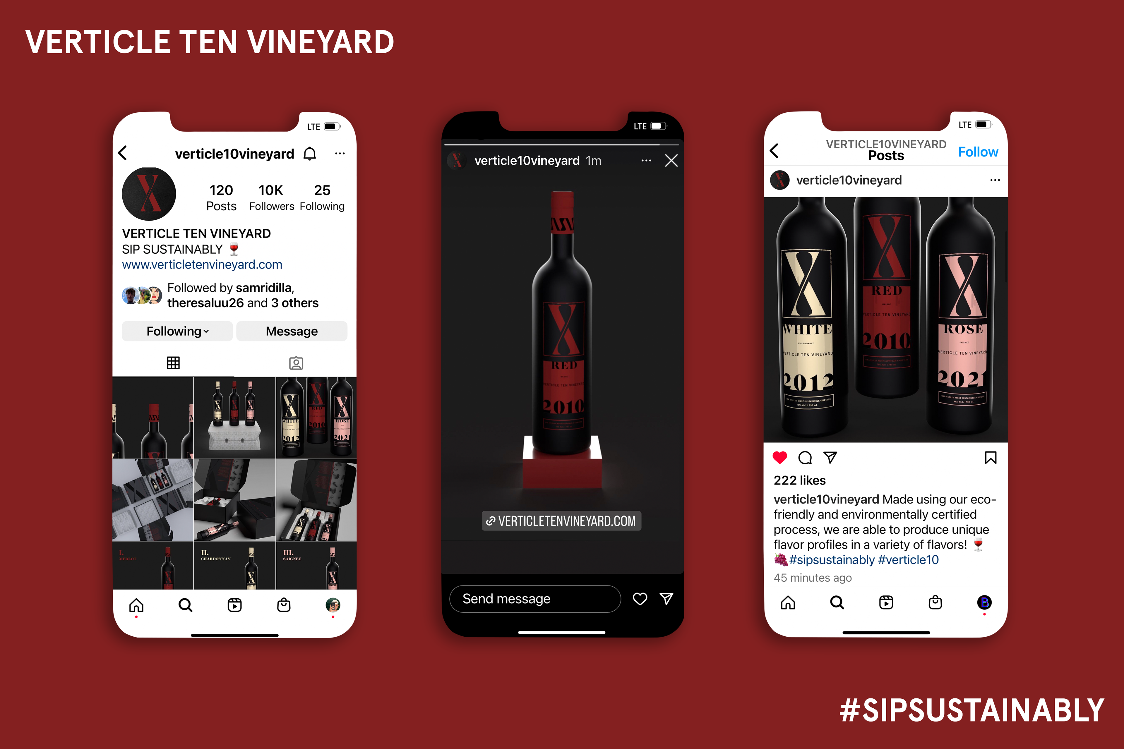
Verticle Ten Vineyard
Verticle Ten Vineyard is an upscale sustainably-minded winery. This brand was created in collaboration with Ecovative, a biotech company that produces a mushroom-based packing material as an alternative to styrofoam. Ecovative partnered with students to use their Mushroom Packaging as part of a promotional mailer in order to display the great utility of their product. We participated in multiple design meetings with our client, discussing our creative solutions and maintaining the integrity of their brand.
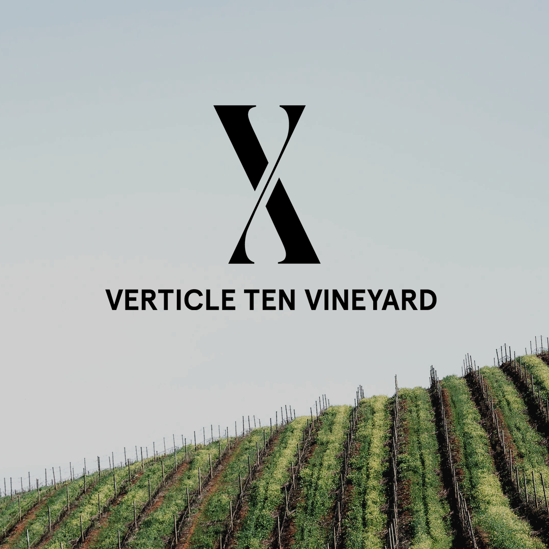
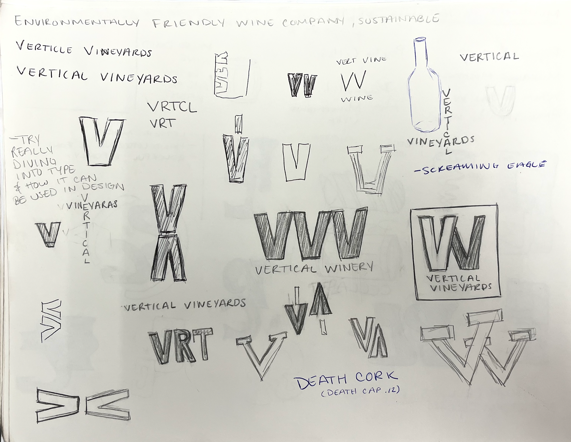
Ver·ti·cle
noun
1. An axis or hinge; a turning point
"the branding of this project is a positive verticle in design"
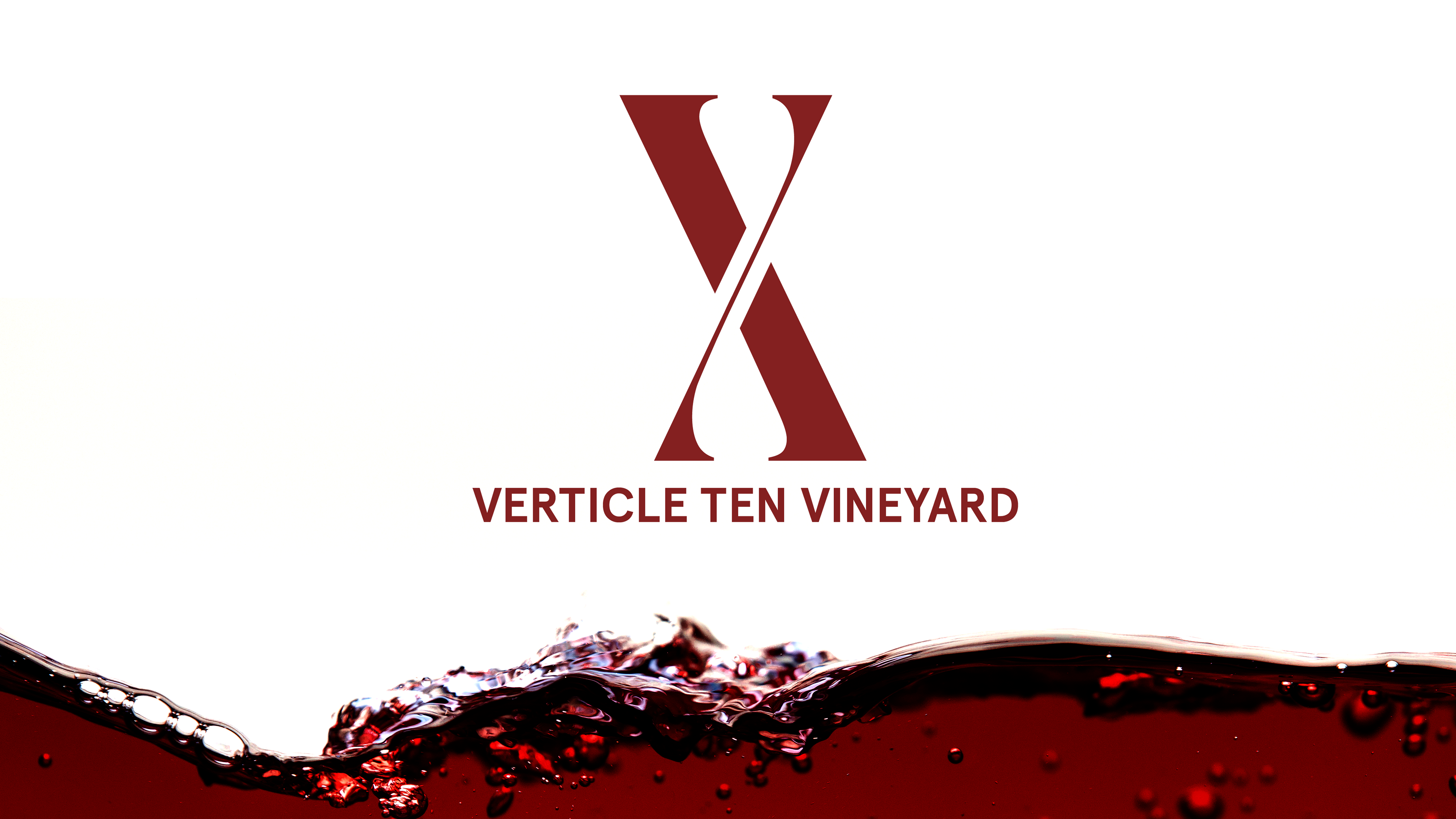
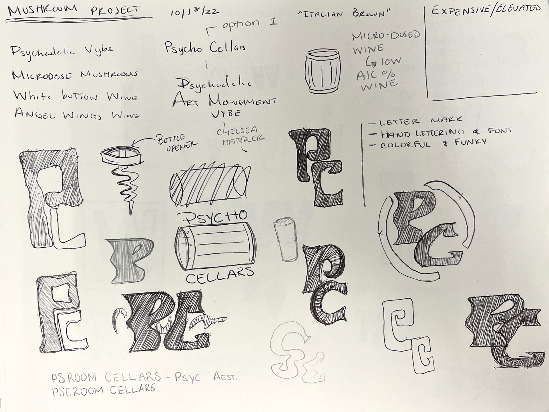
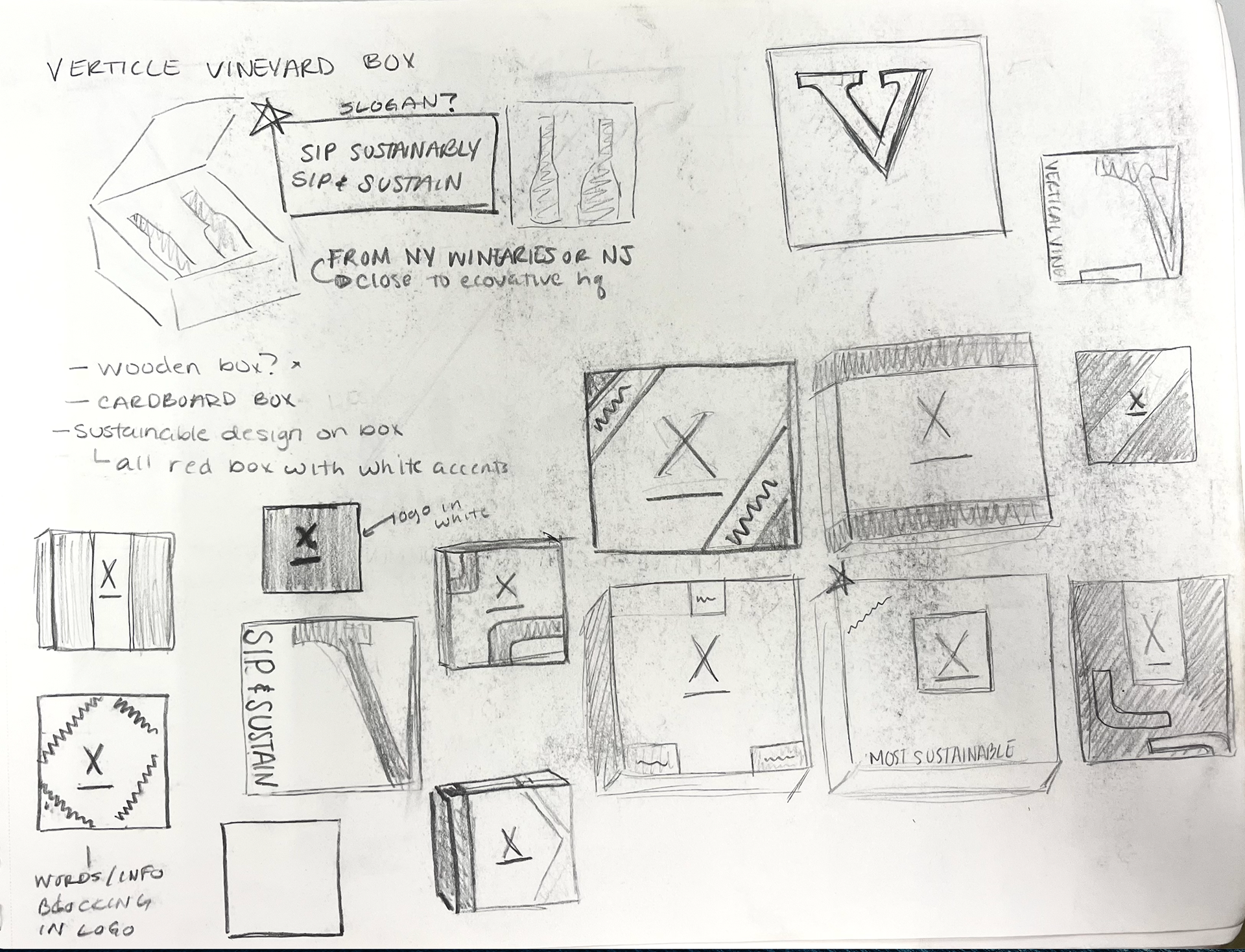
The Logo
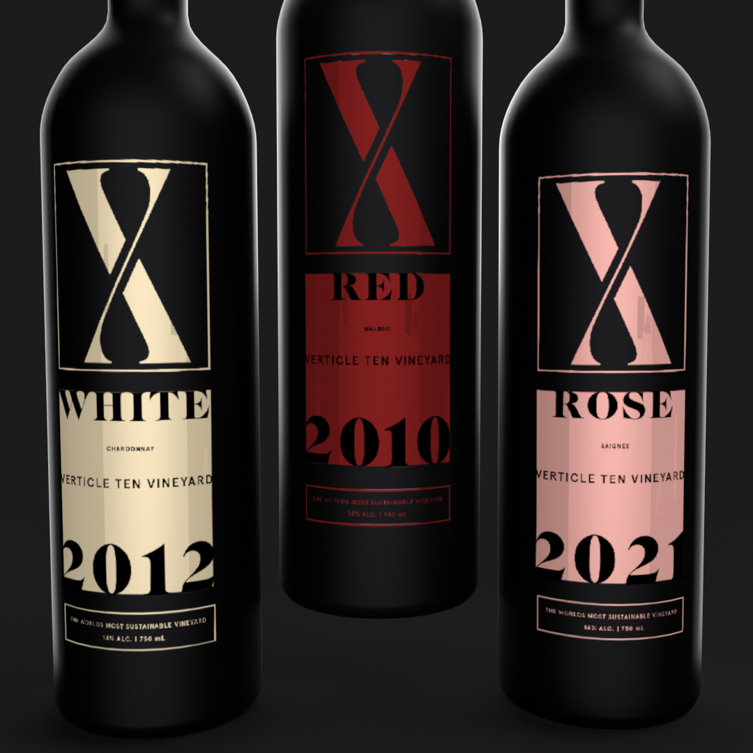
The logo can be viewed in two different ways. This type-driven logo utilizes an elegant font to function as a roman numeral ten as well as two letter v's stacked onto each other, representing Verticle Vineyards. Working perfectly as a Primary logo when mixed with type, and a letter mark when used alone, the true versatility of this logo is displayed! Choosing "verticle" to show a turning point for change resonates with the mission more than the traditional up-and-down meaning of "vertical".
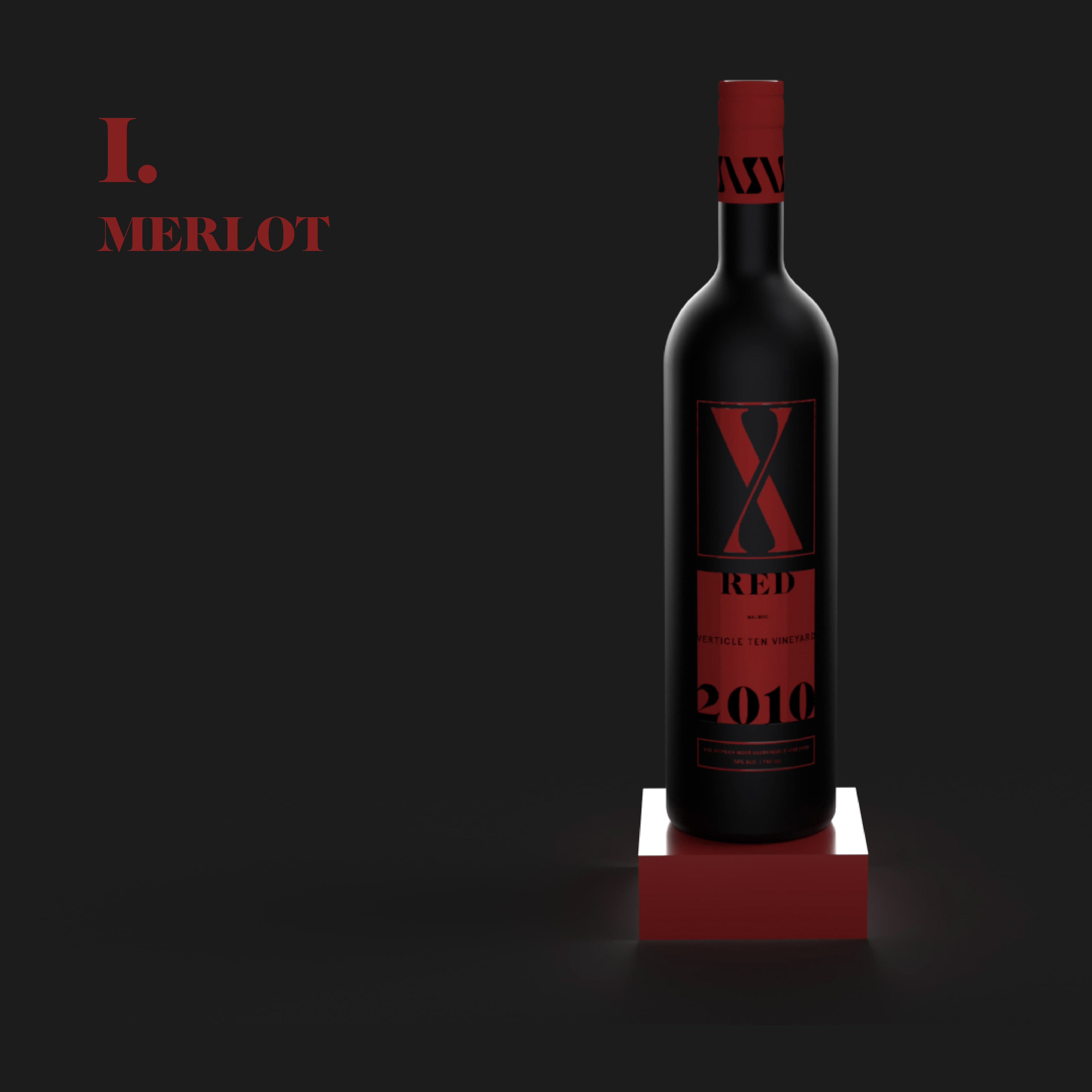
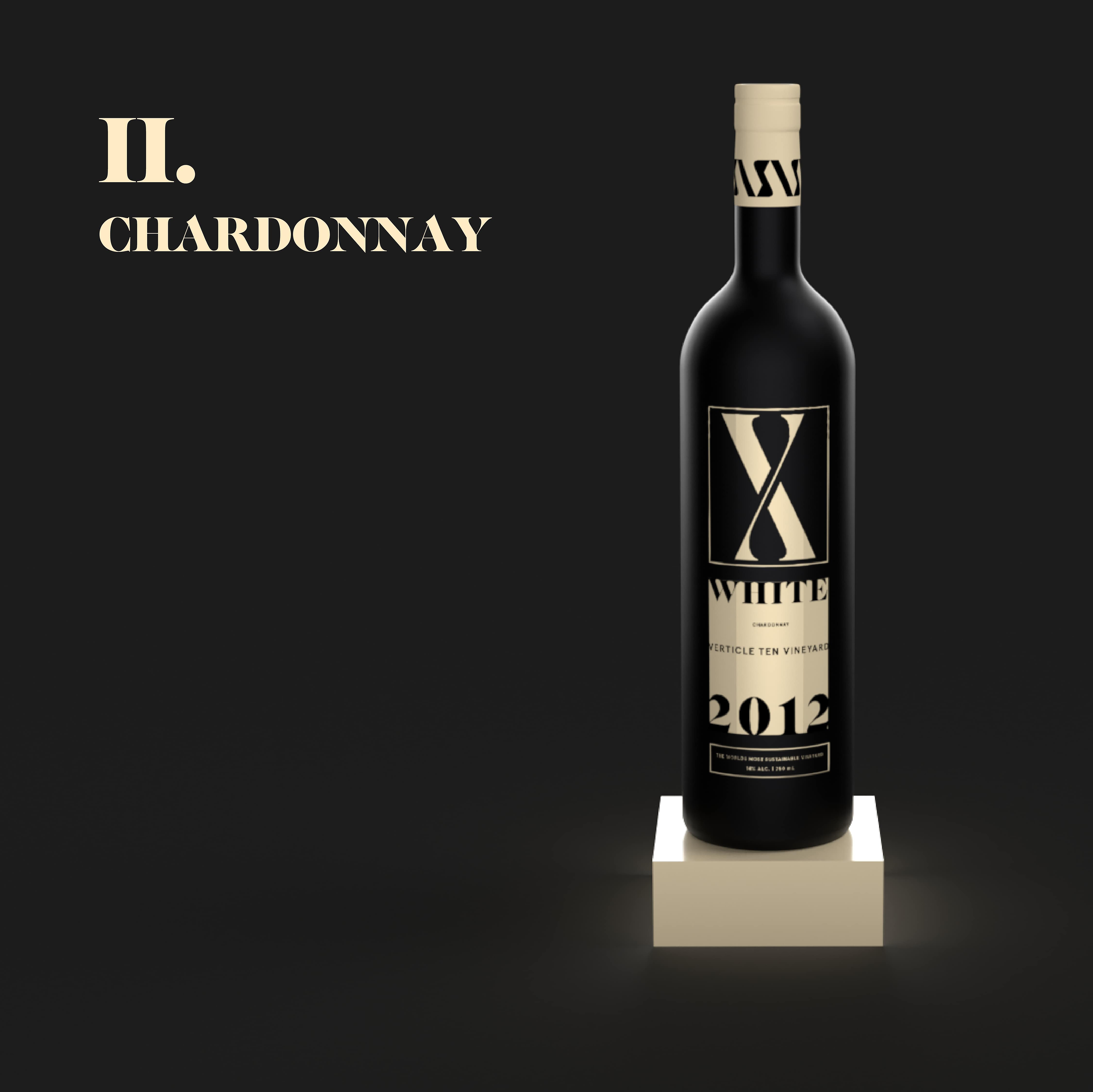
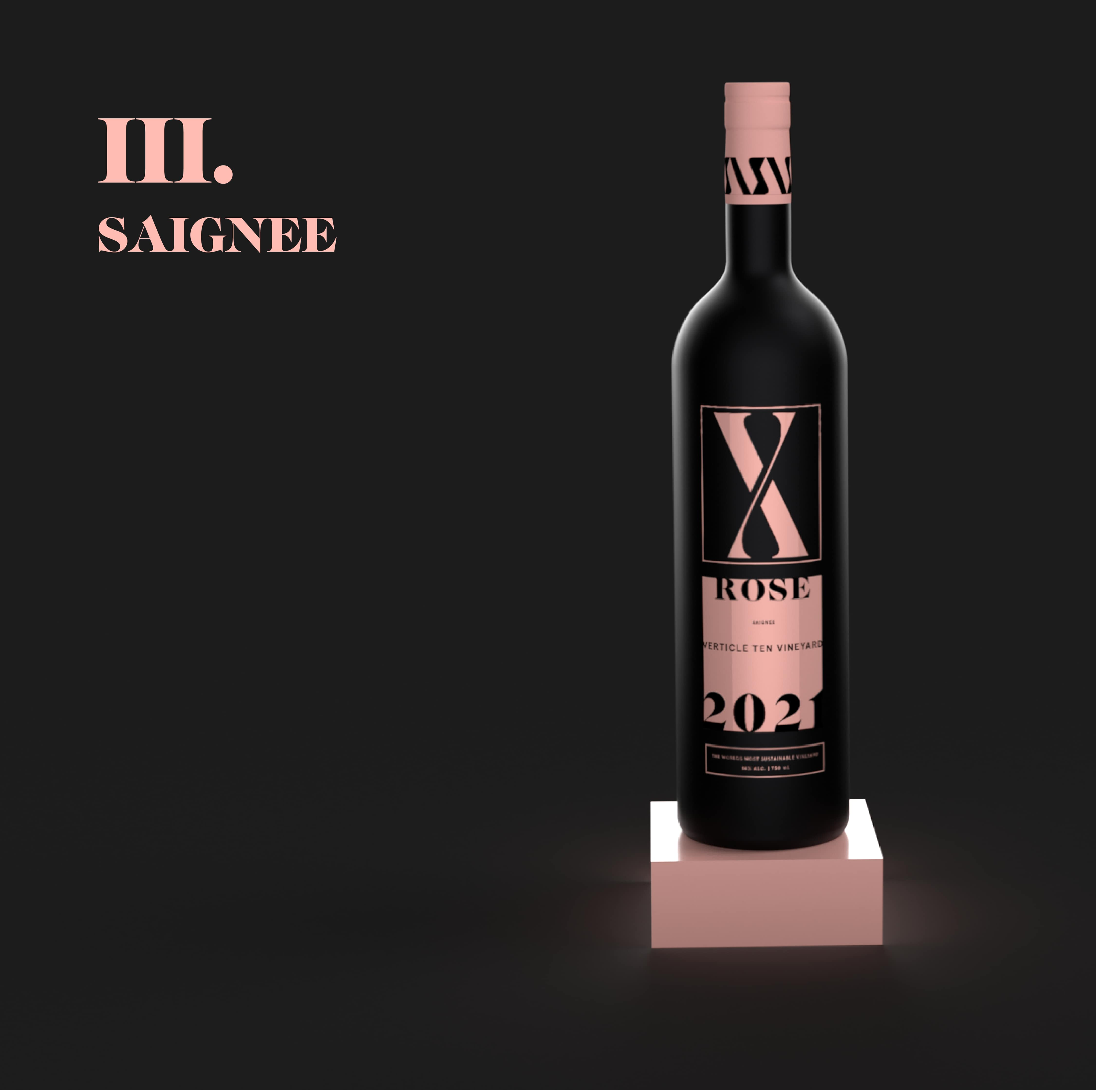
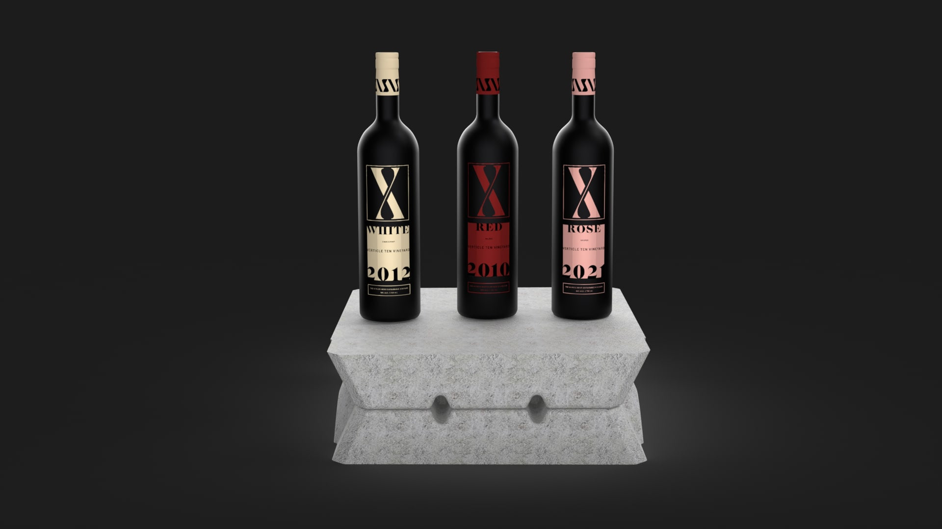
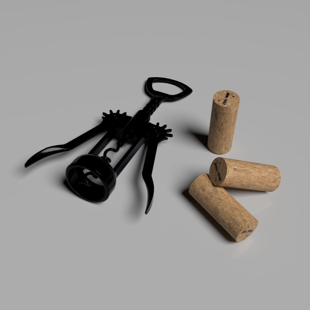
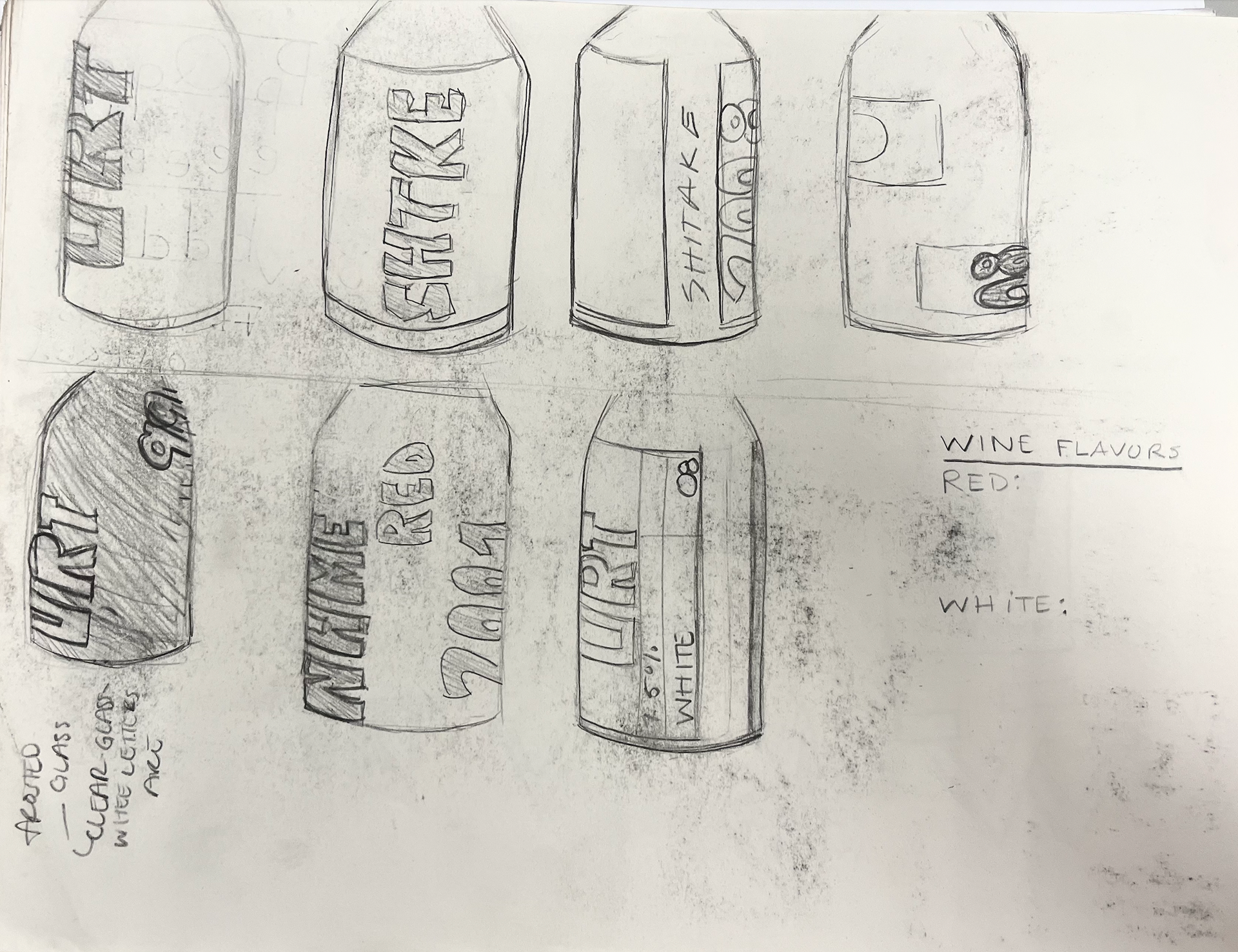
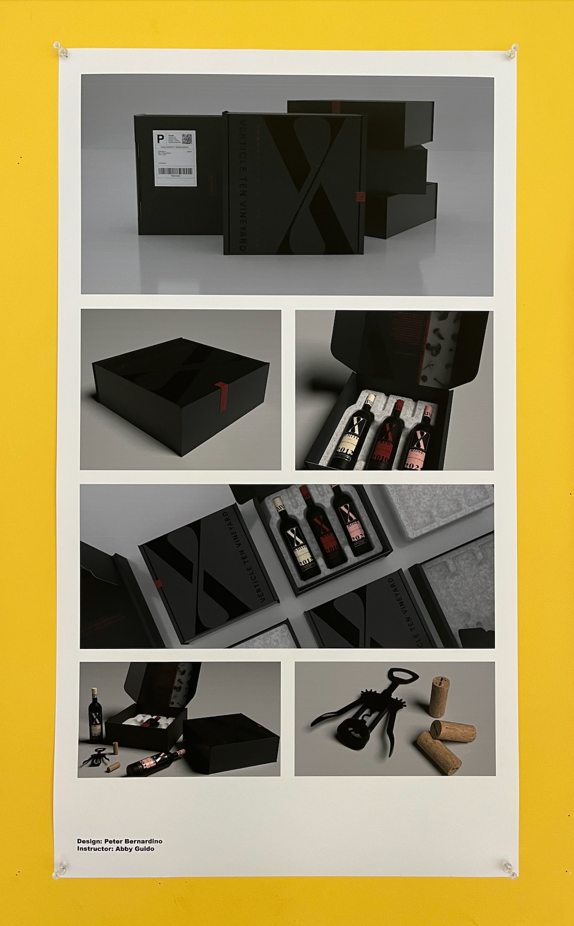
The Bottle Design
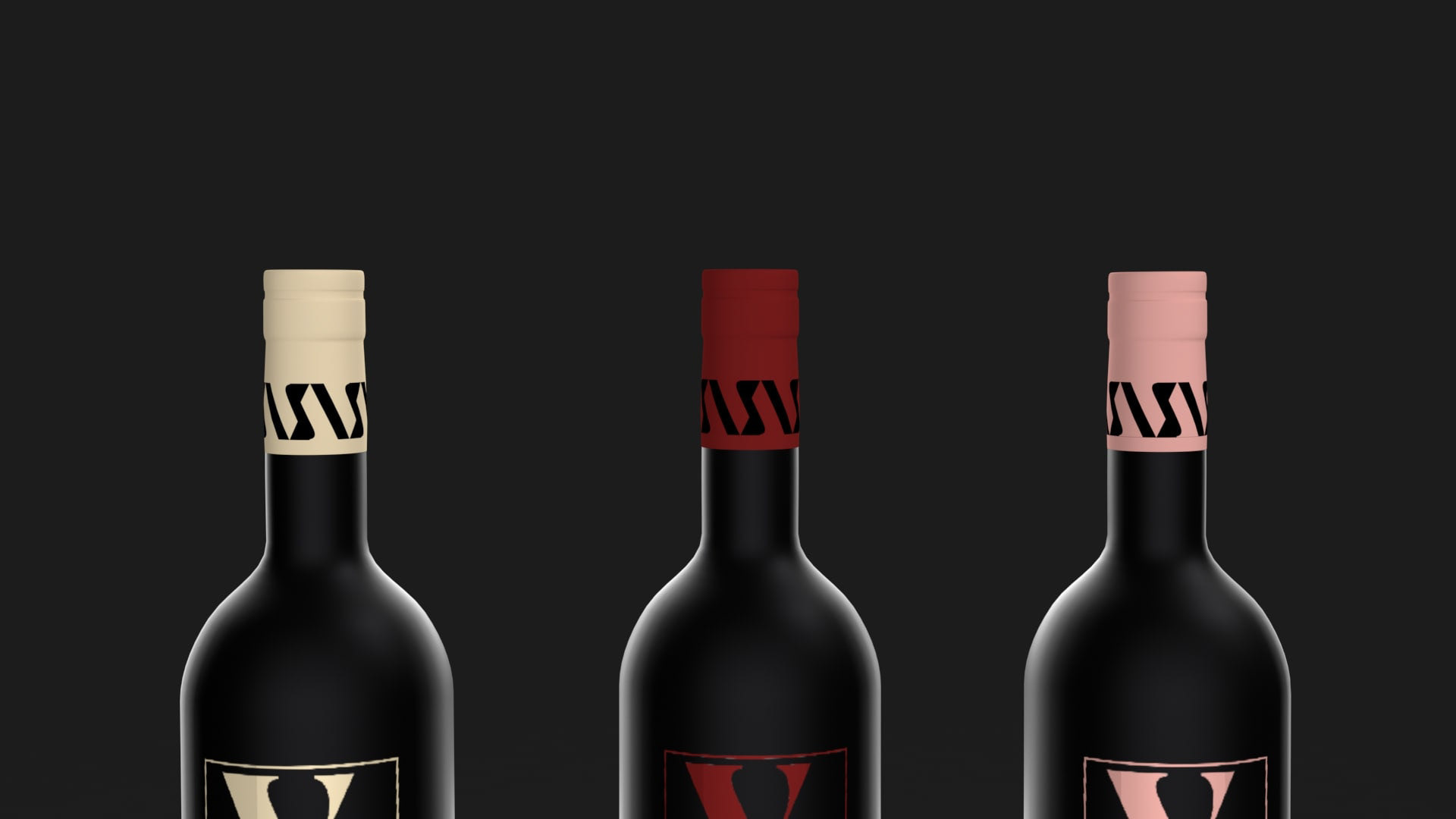
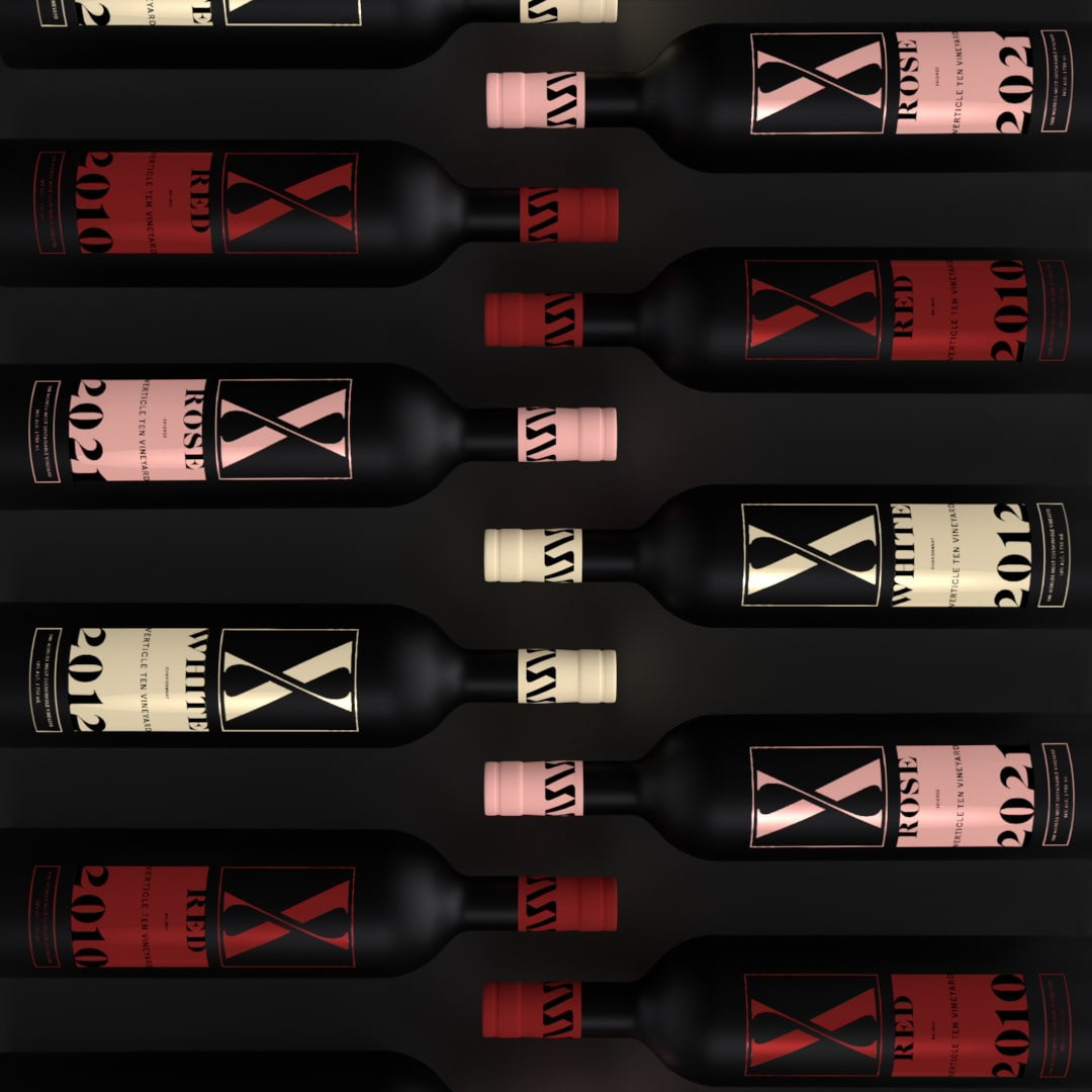
The bottle design is enriched and refined due to the variety of materials as well as the intricate label design. A vertical label was necessary for these bottles to fully maximize the considered design elements. Using an etched label on a matte black finish allows for the implementation of positive and negative space, creating imagery through the consideration of typography. The wine seals at the top of the bottle use repetition of the logo, forming not only a pattern but consistency and opulence as well.
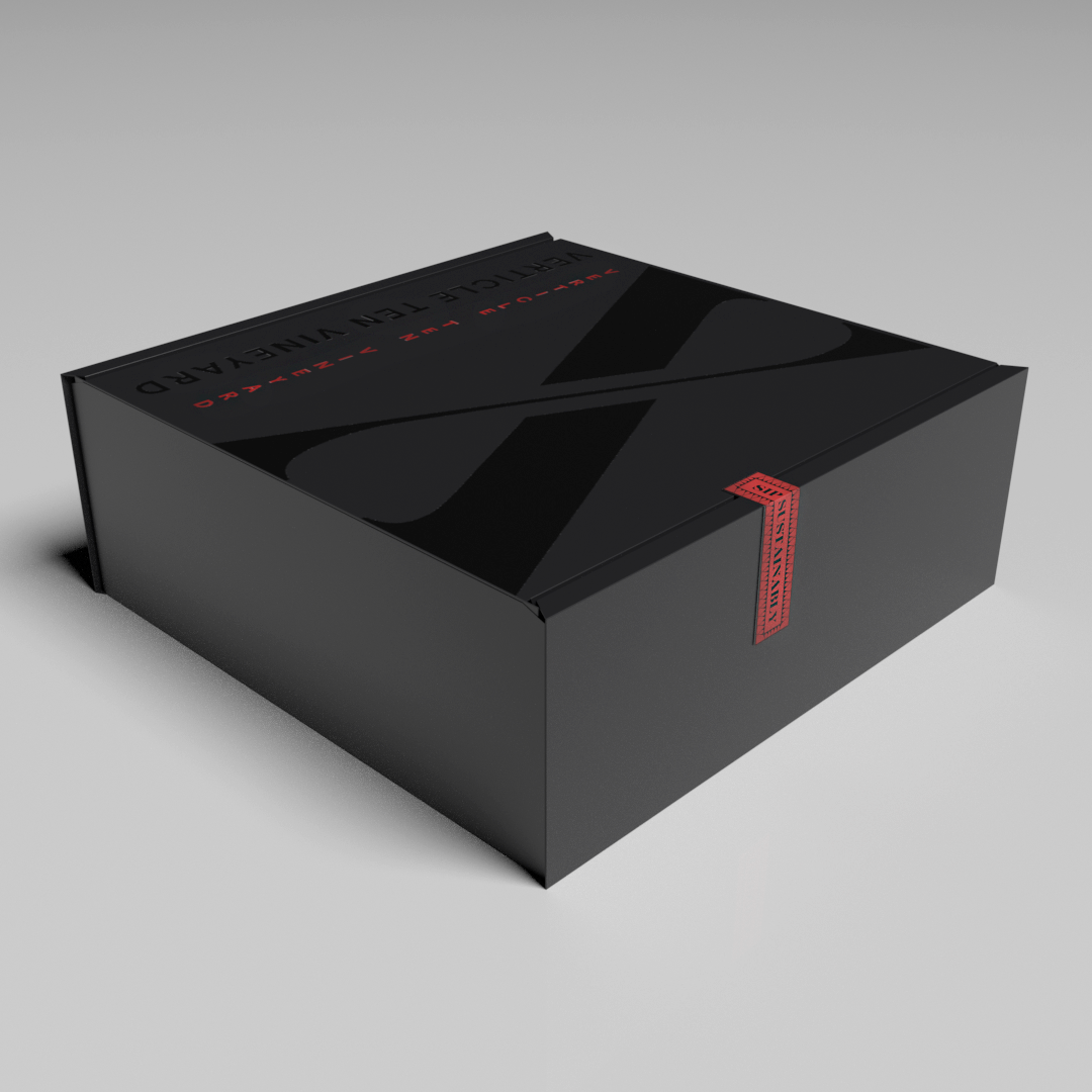
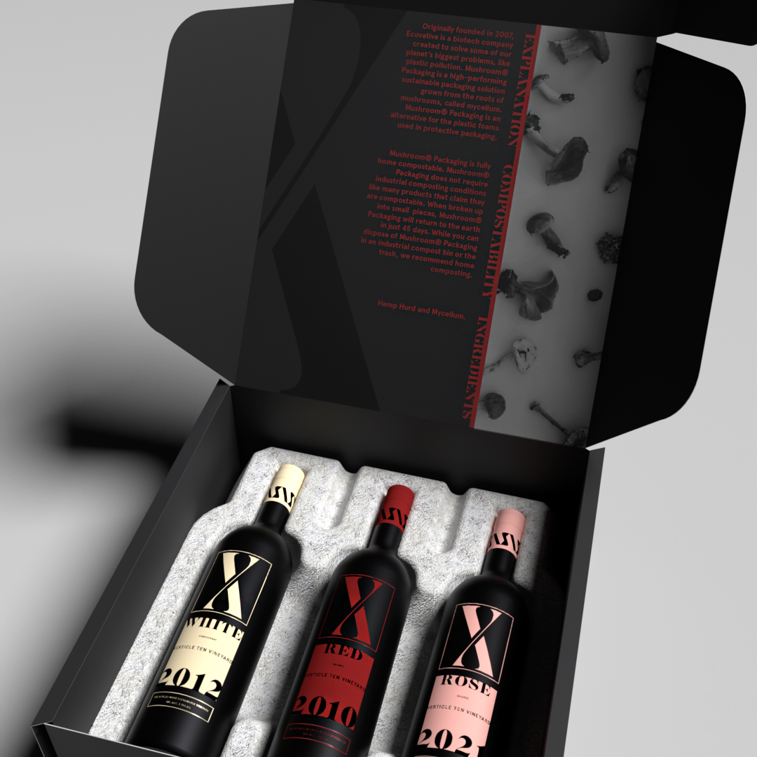
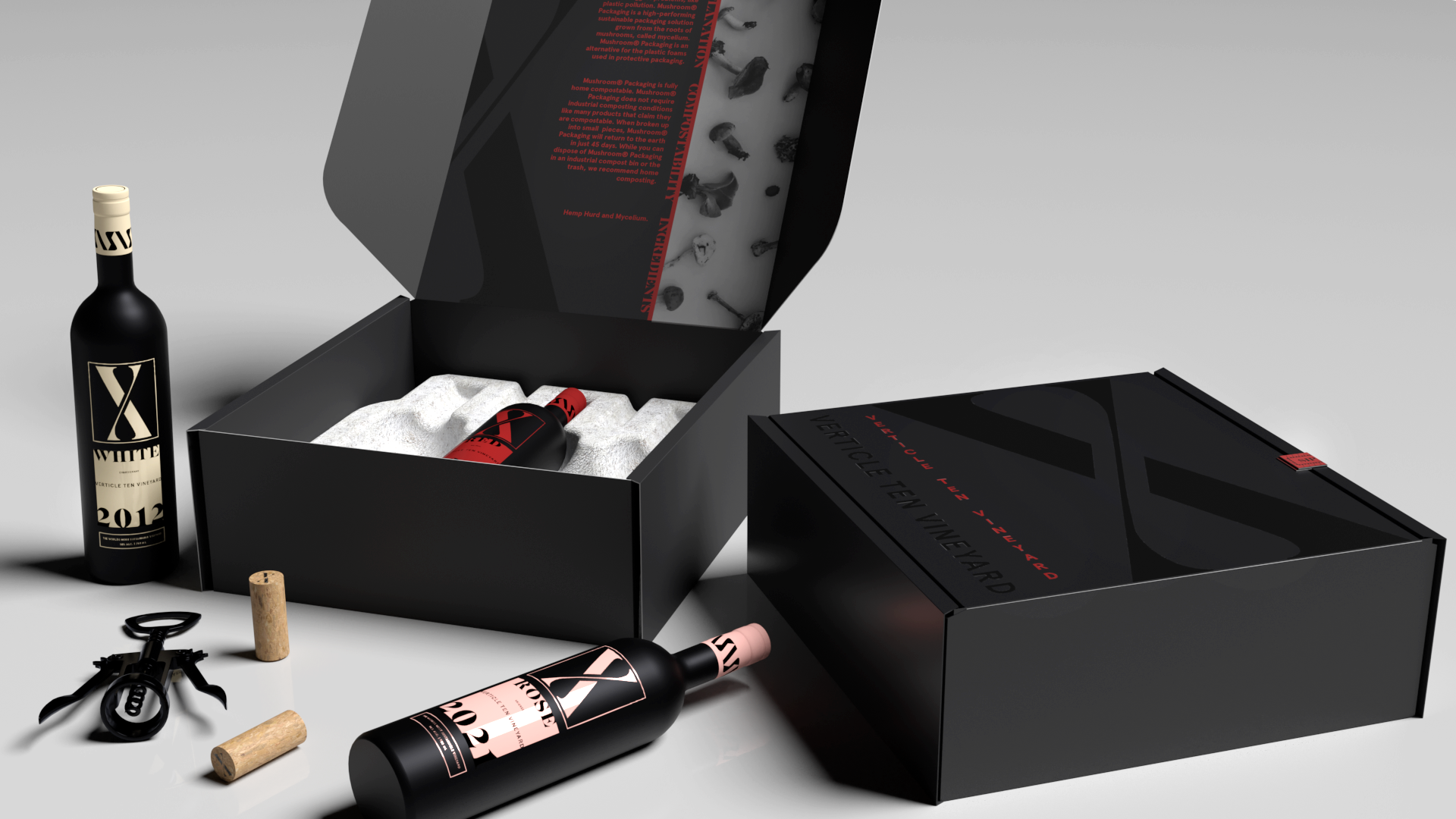
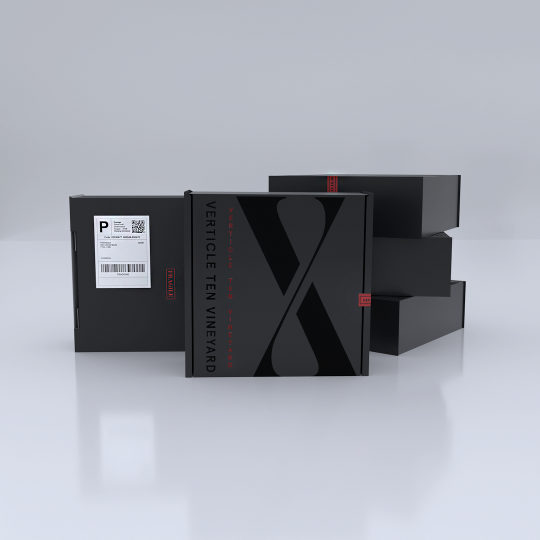
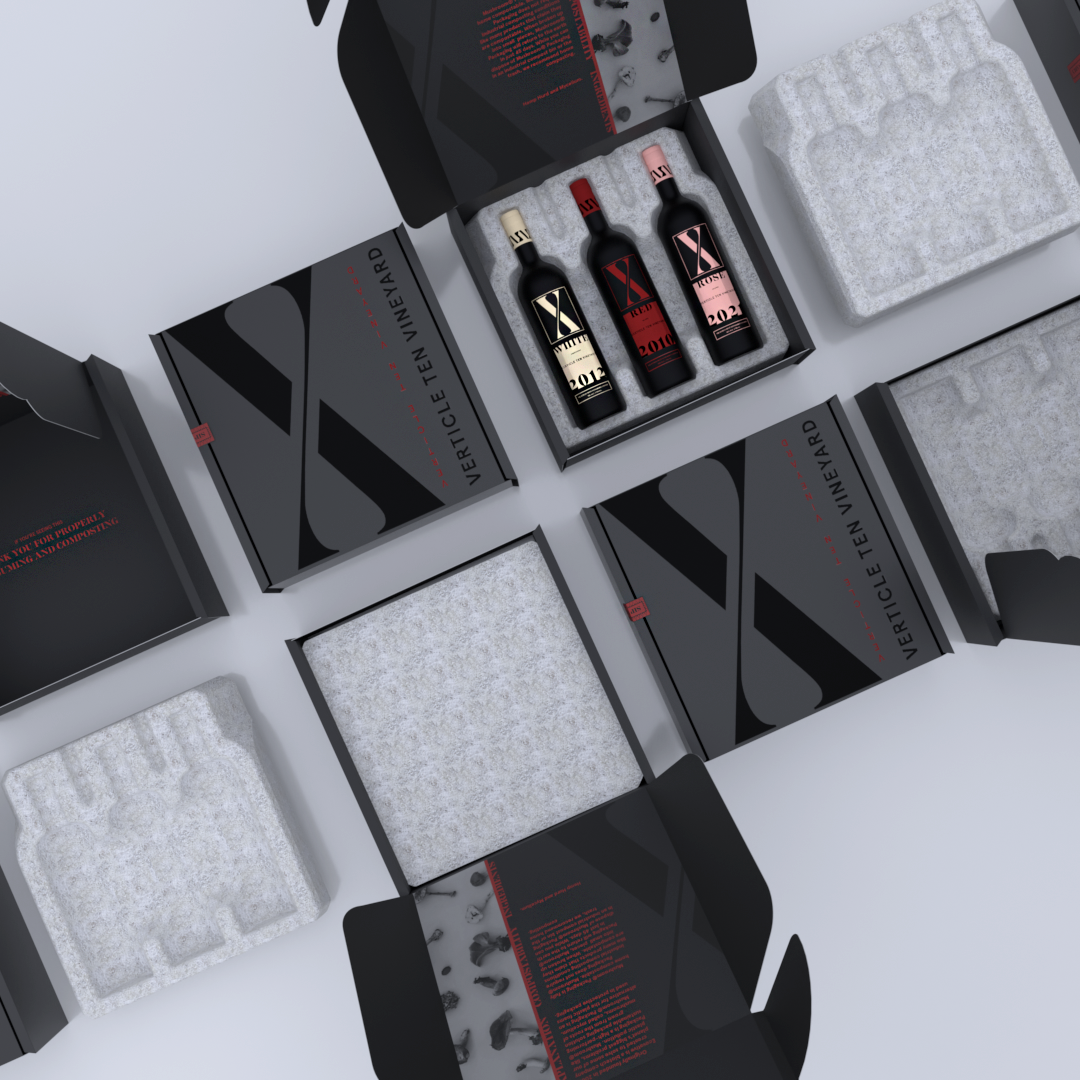
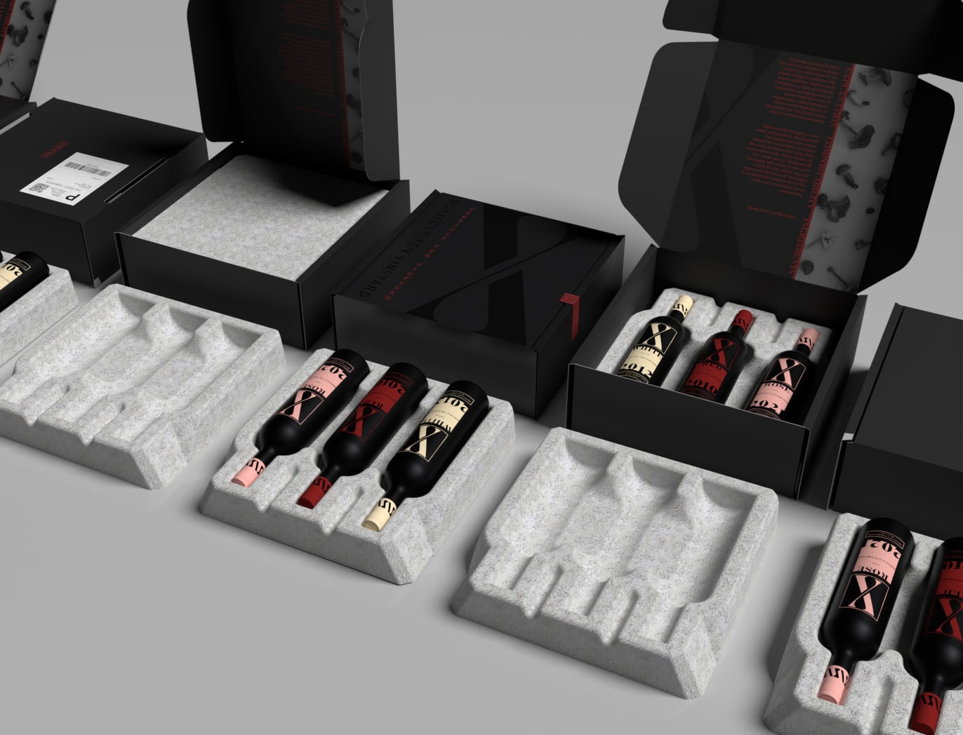
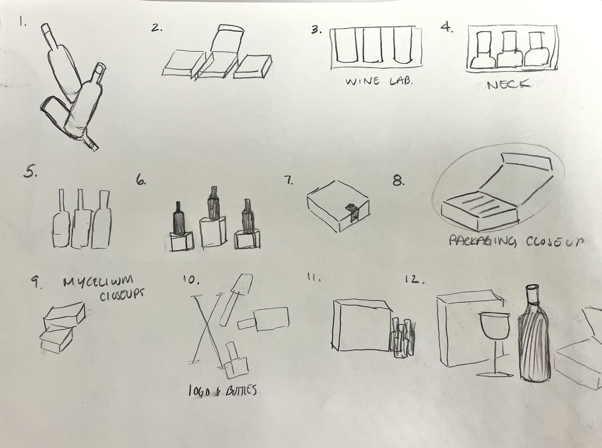
The Mailer Packaging
We know the packaging is too pretty to throw away! The consideration and execution of elements such as glossy finishes on a matte texture is not the only decision that makes this packaging precious. The balanced implementation of dark red allows for details that create visual movement throughout. Additional design aspects that elevate the overall packaging can be the utilization of an exterior sticker seal. The exterior sticker seal pulls imagery from the logo, to create a decorative border and increase cohesion. This border then houses the brand's slogan and overall mission. Not only does this strengthen the visual identity, but it also strengthens the brand's identity.
The Mushroom Packaging
The mushroom packaging is a high-performing sustainable packaging solution grown from the roots of mushrooms, called mycelium, and is home-compostable in 45 days. Made with two ingredients, hemp hurd, and mycelium, makes it a performance-competitive solution for custom-molded products and is a nutrient, not a pollutant. Learn more about Evocative and the process on their website!
Institution: Tyler School of Art and Architecture
Art Direction: Abby Guido
2022