What is juicedUP?
Never grow up with this modern collection of fresh-pressed juice boxes... With a target audience of grown-up consumers 18+, this conceptual company maintains the balance of our inner youth and adult lifestyle. Effortlessly inflicting nostalgia, juicedUP is the perfect way to boost up your day! The unique flavor range makes it the perfect drink for all times of day and pairable with any meal. Whether you're on your way to class, in a corporate meeting, or taking the kids to soccer practice, juicedUP will be your backup!
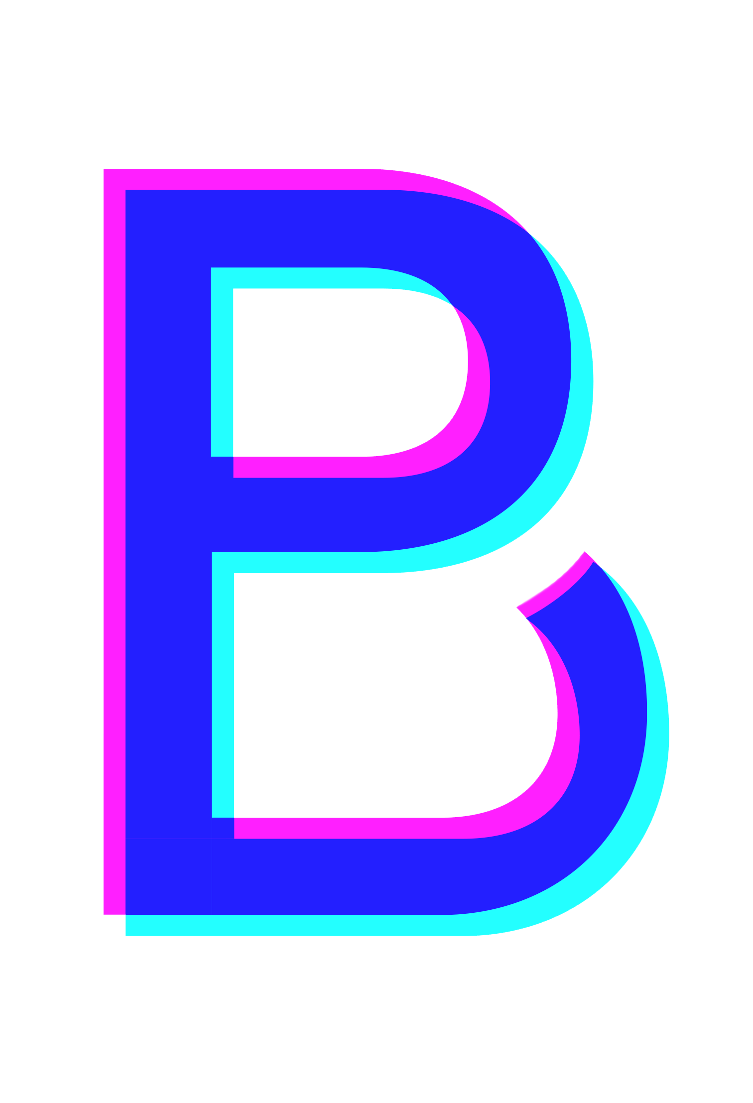
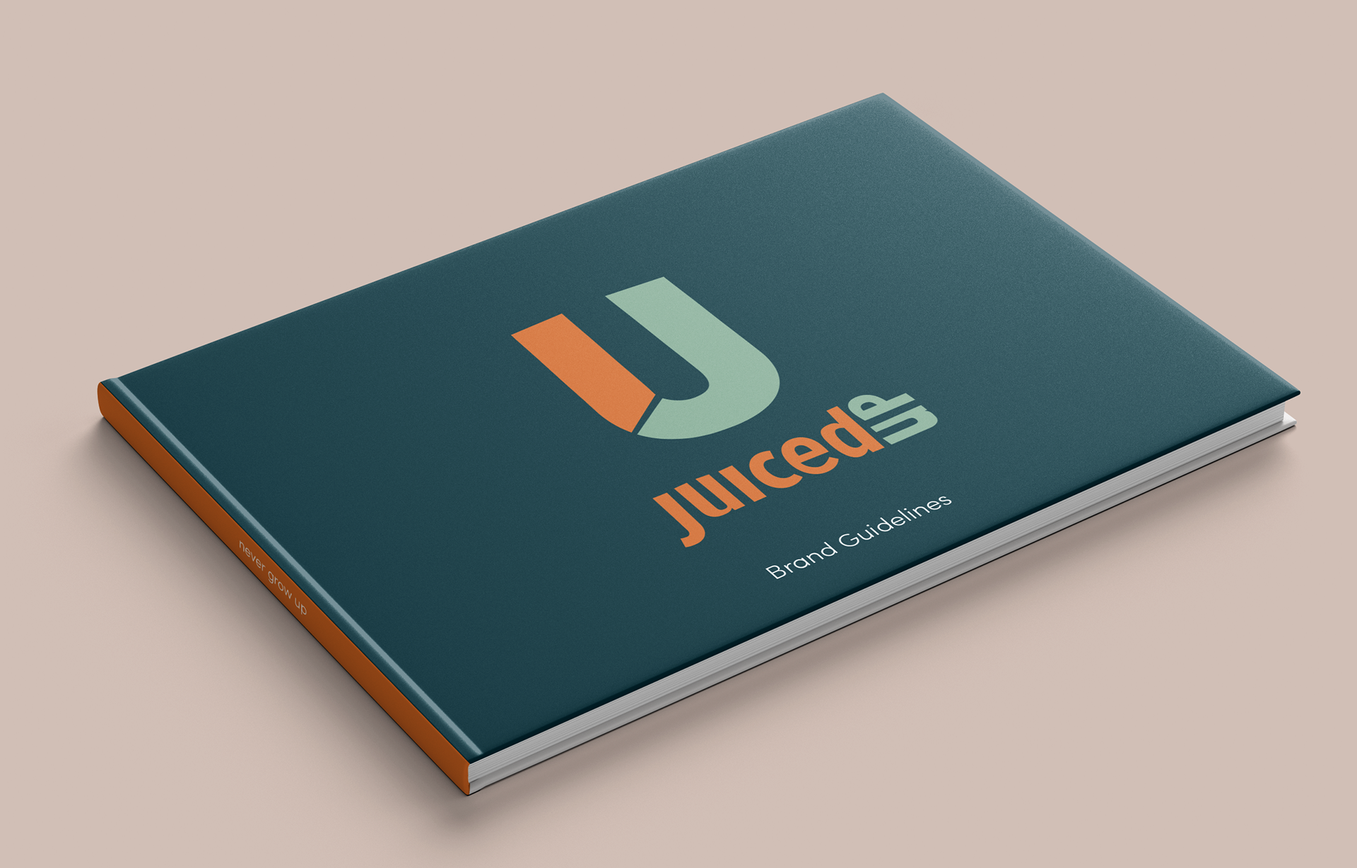
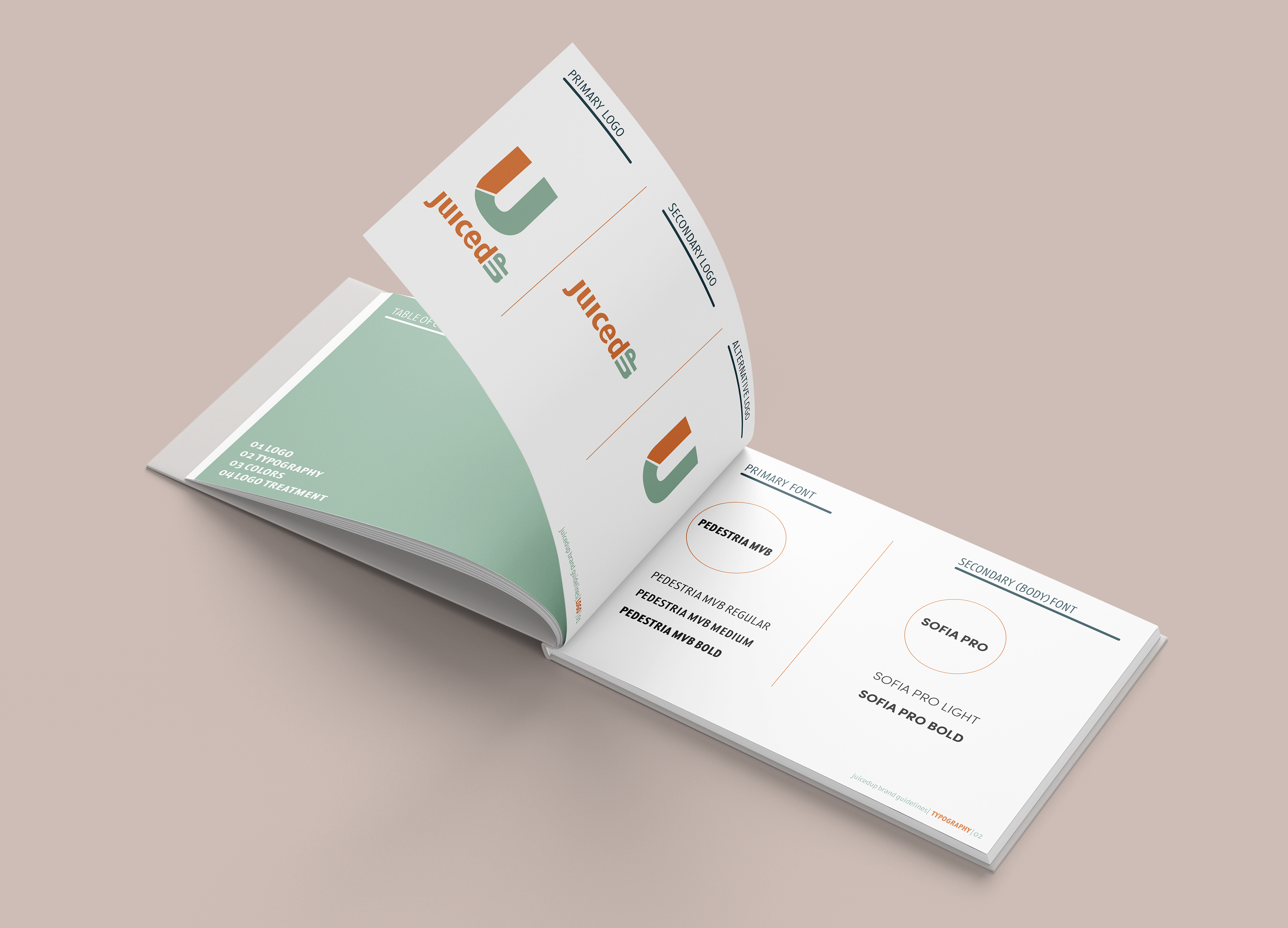
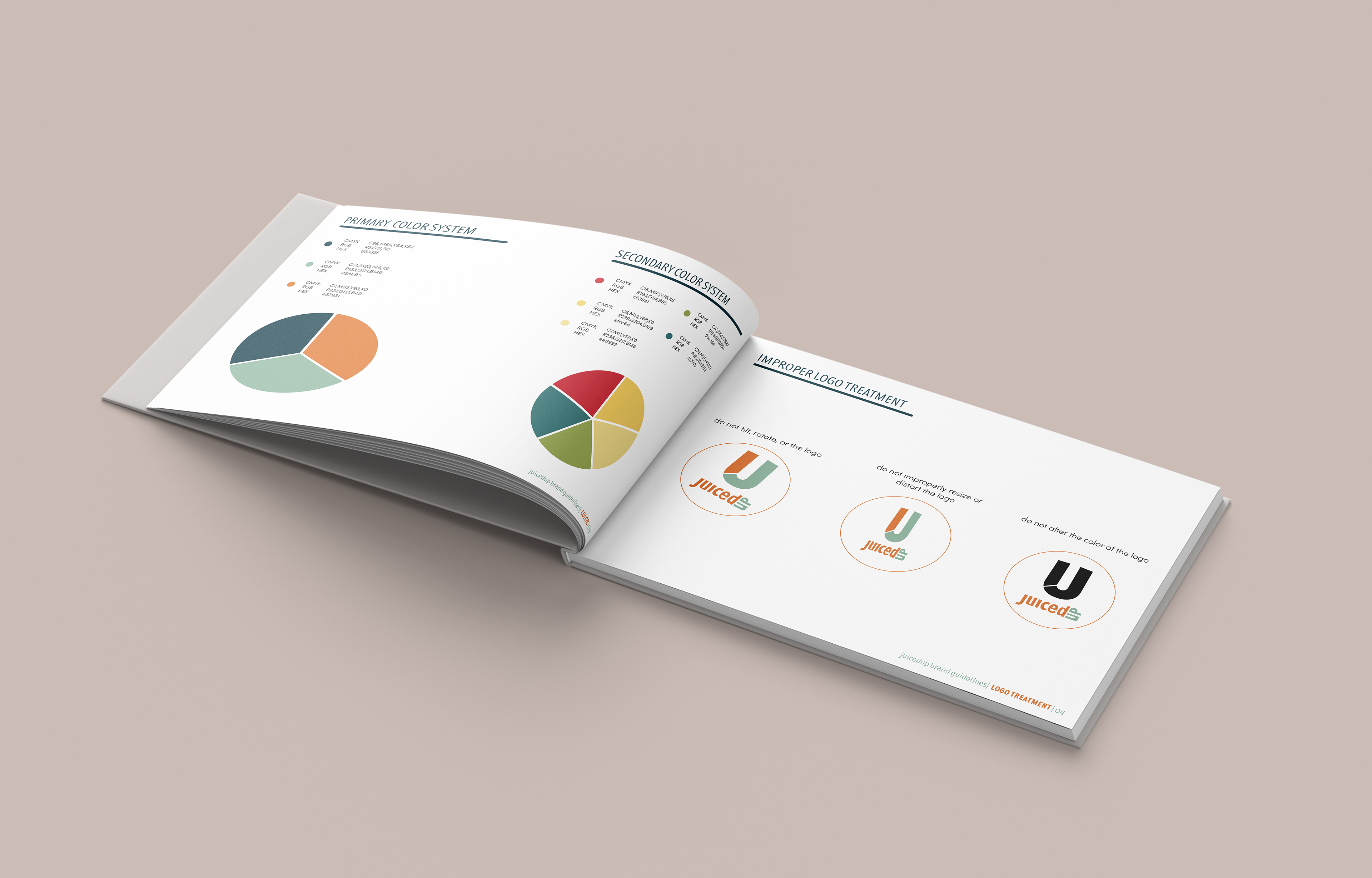
Logo and Lettermark
Implementing an organic nature into this brand was vital when developing the design. It can be successfully seen in the modification of typefaces and line work on the letter mark. Using a strong color shift and a slight amount of negative space to create a visually readable logo design. Assuring that the letter mark and type-based logo shared similar properties required balance and extreme attention to detail.
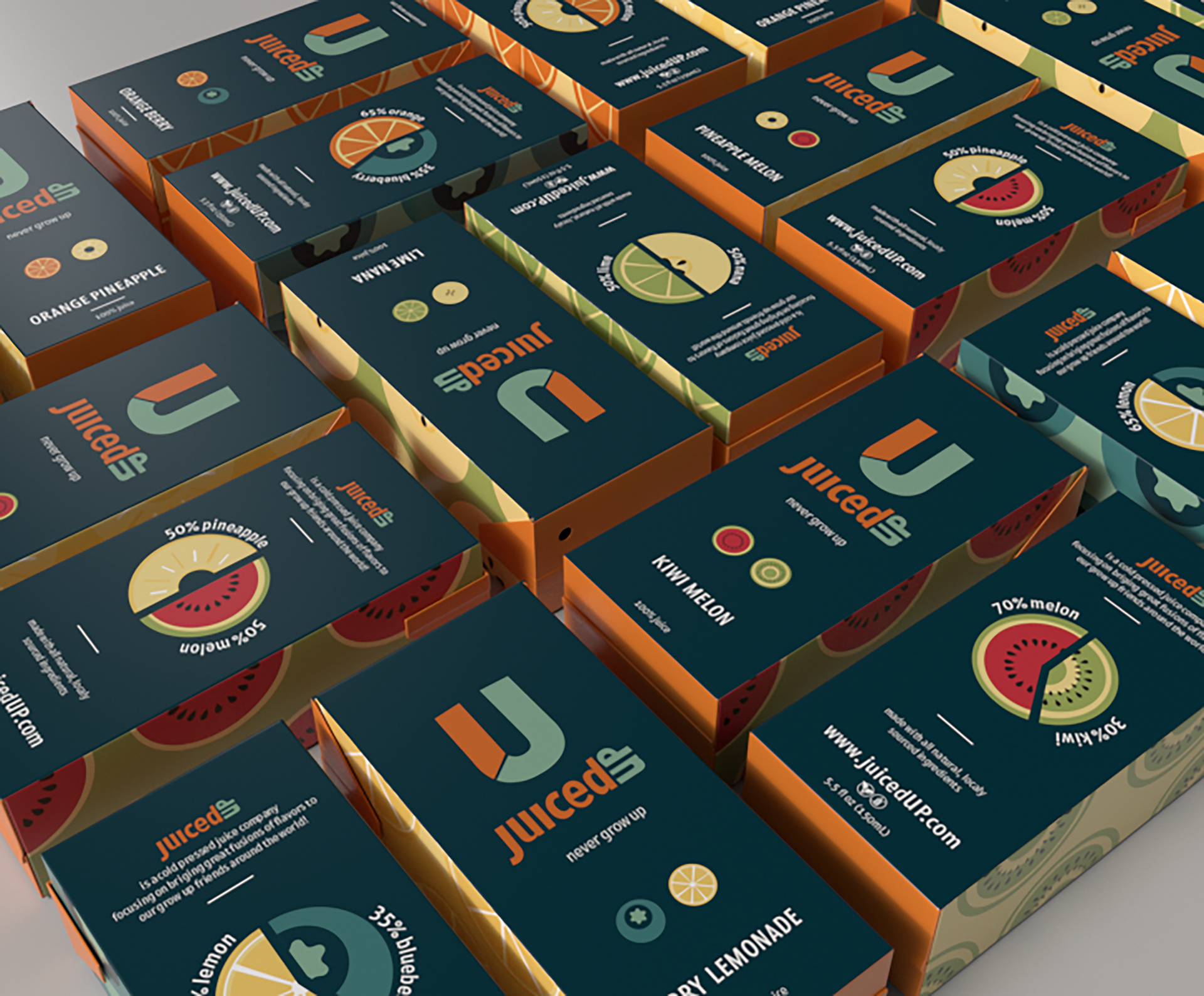
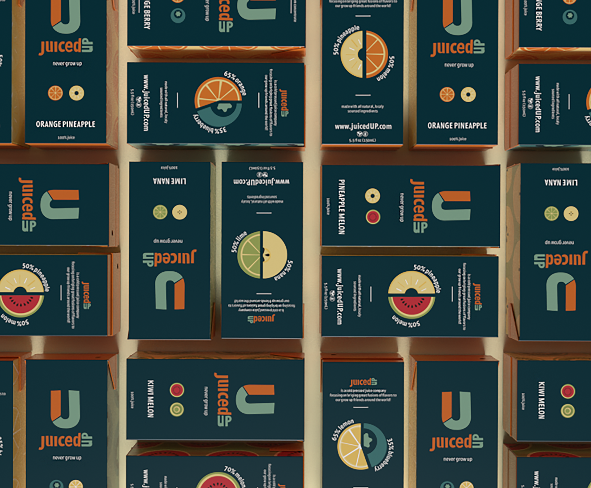
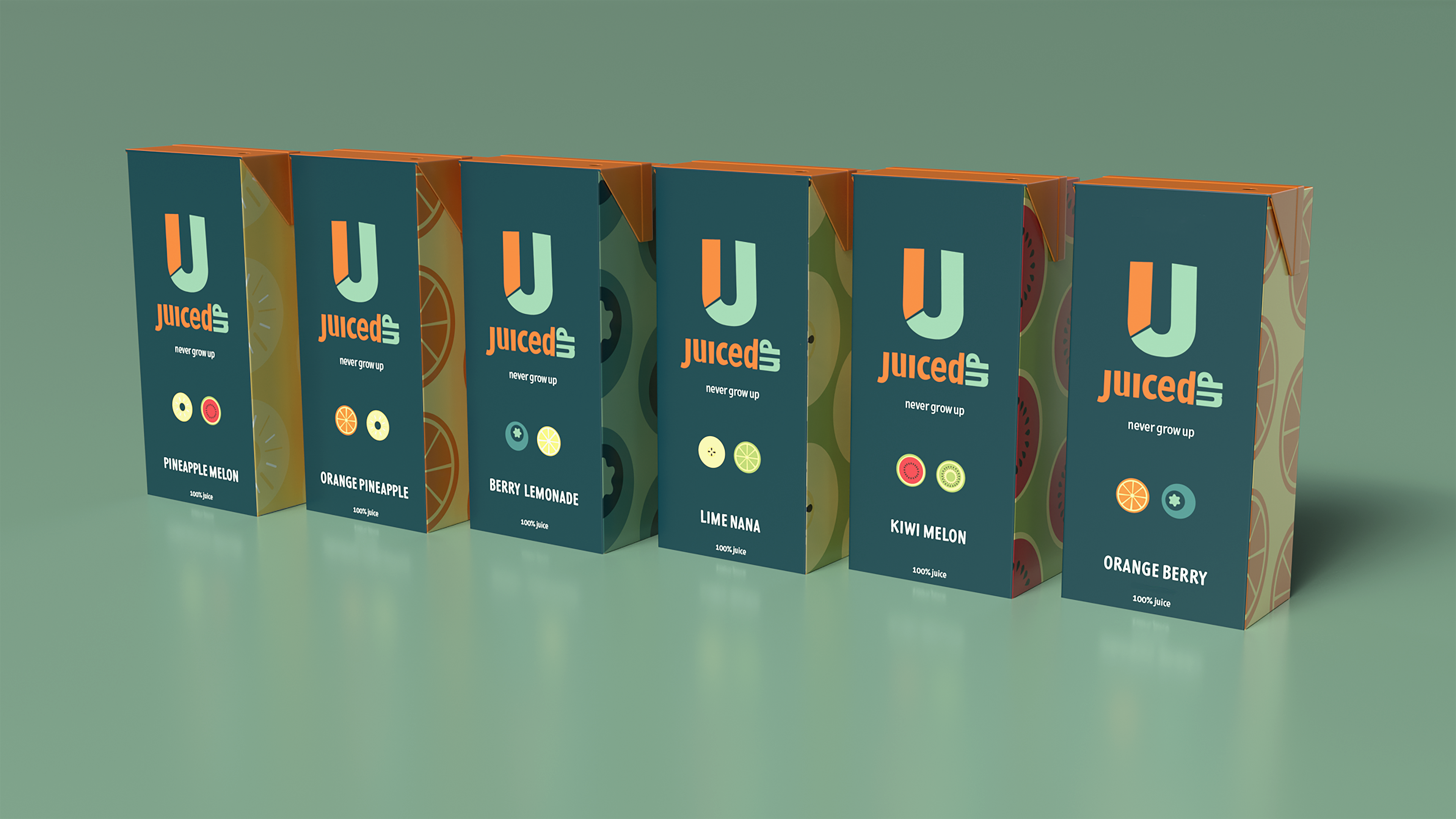
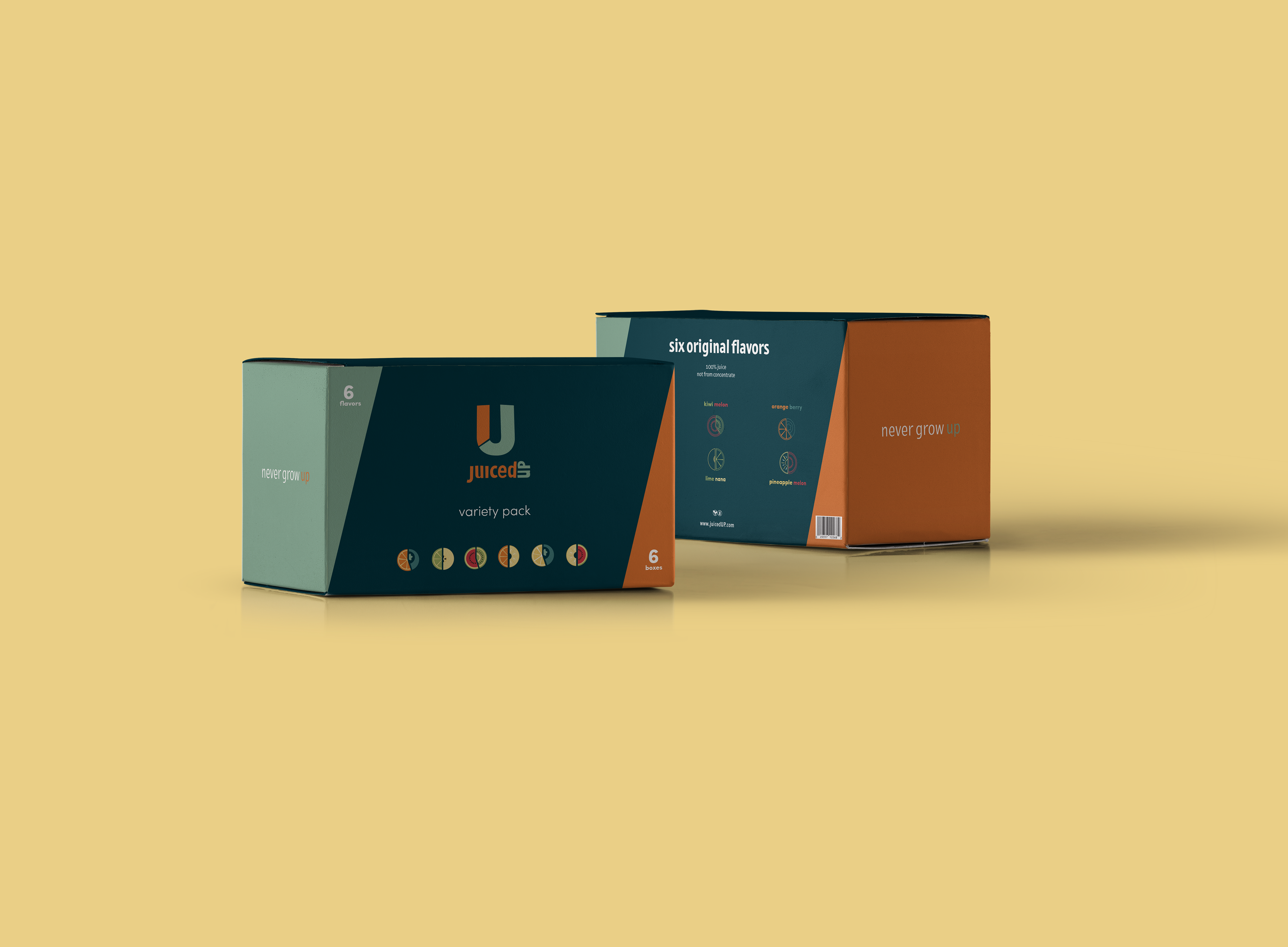
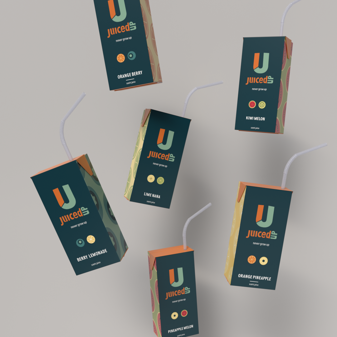
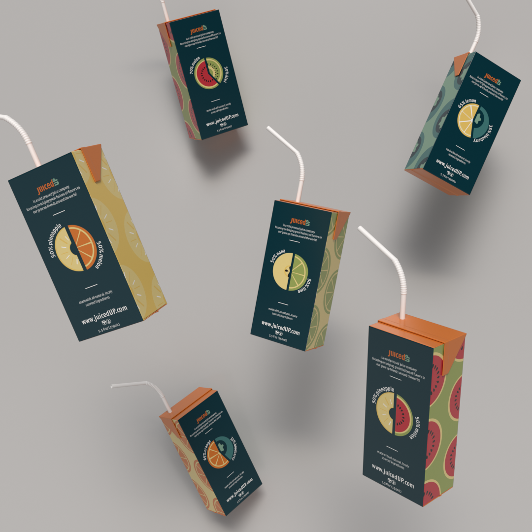
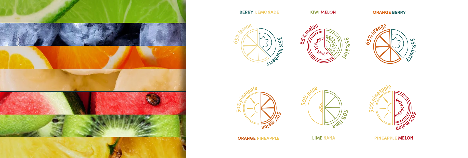
Juice Box Design
Revamping the traditional visuals of existing juice boxes was a great challenge when designing for the public good. Using a mature color palette and minimal illustration style to maximize my audience and remain accessible to all. The standard, cardboard juice box form, allowed me to instill nostalgia into the brand through the imagery and experience provided. How you may ask? Popping the straw into a juice box creates a unique experience for users as opposed to unscrewing a cap... Simple as that.
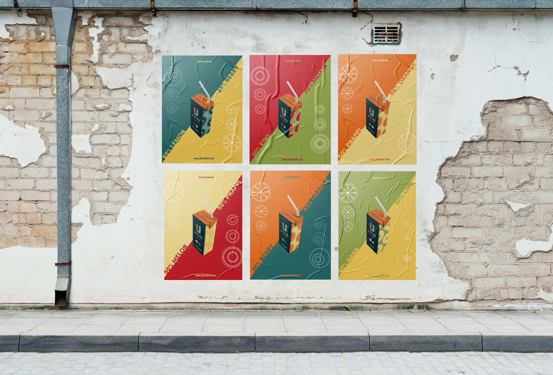
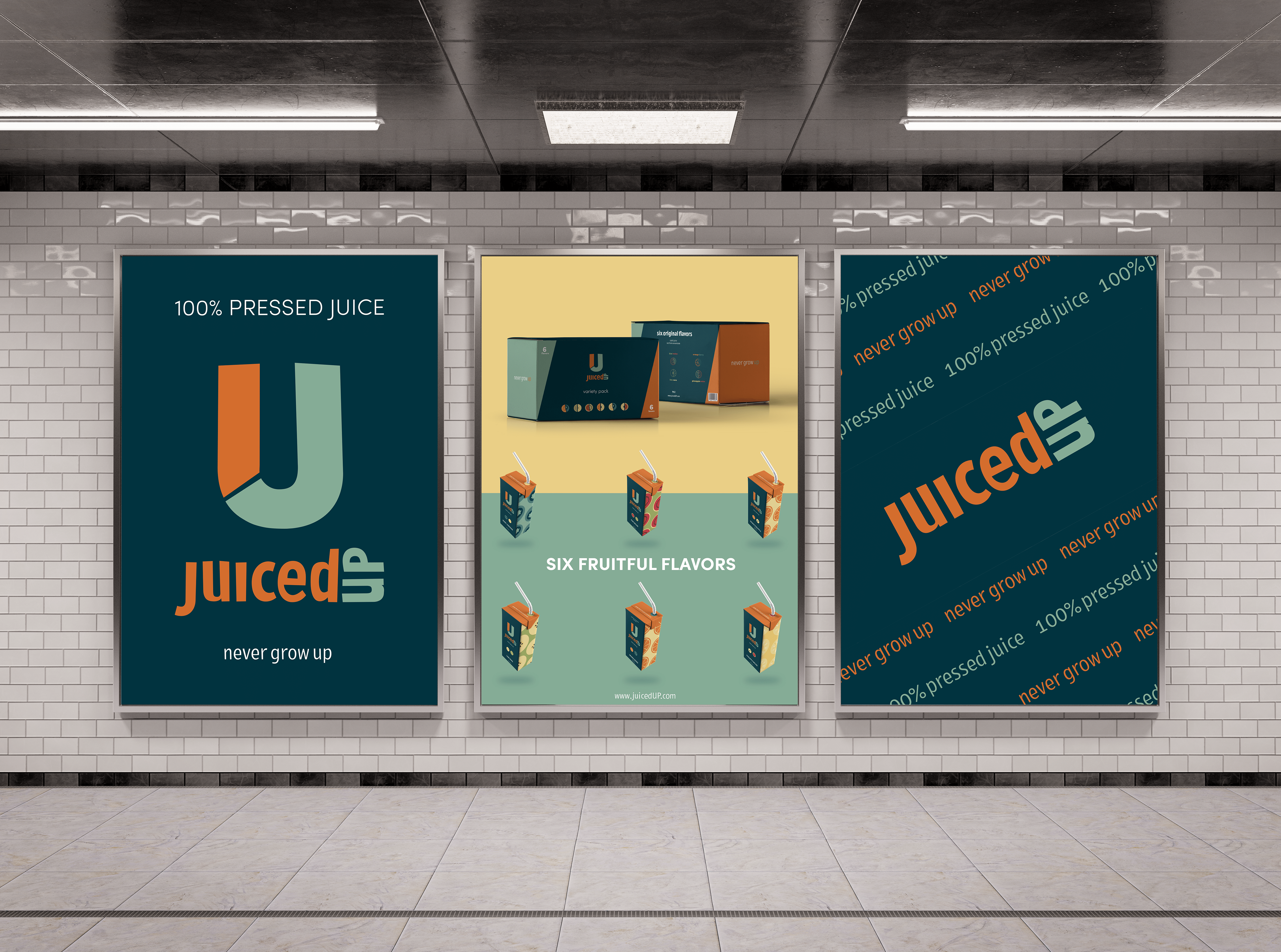
Poster Series
Pulling brand elements to create promotional graphics challenged me to consider what would be desired for this company and its consumers. Wheat-paste posters helped emulate the energy this brand radiates. Using the brand's extensive color palette to its maximum potential while functioning well with product imagery and information allowed me to break creative restraints.
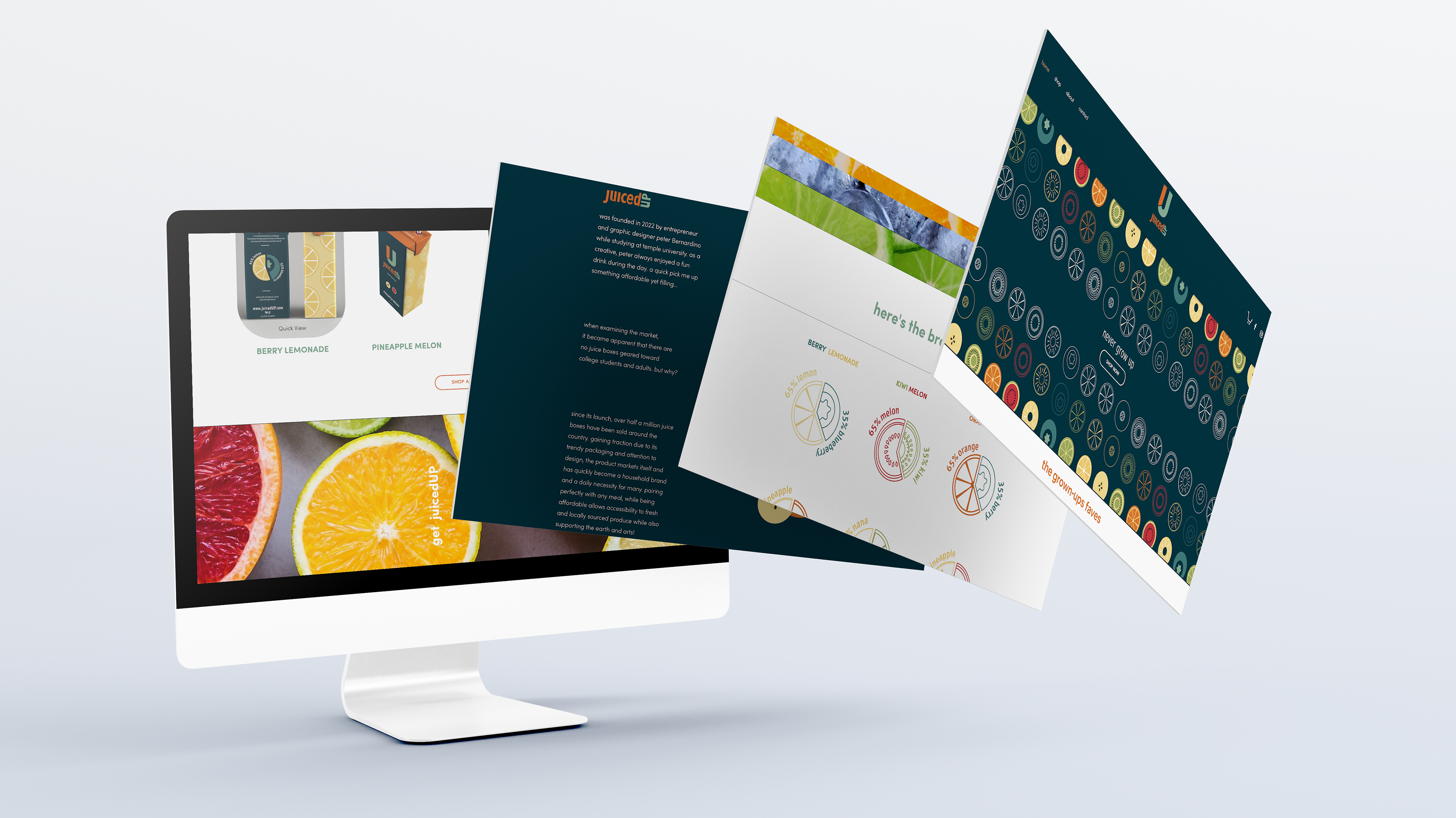
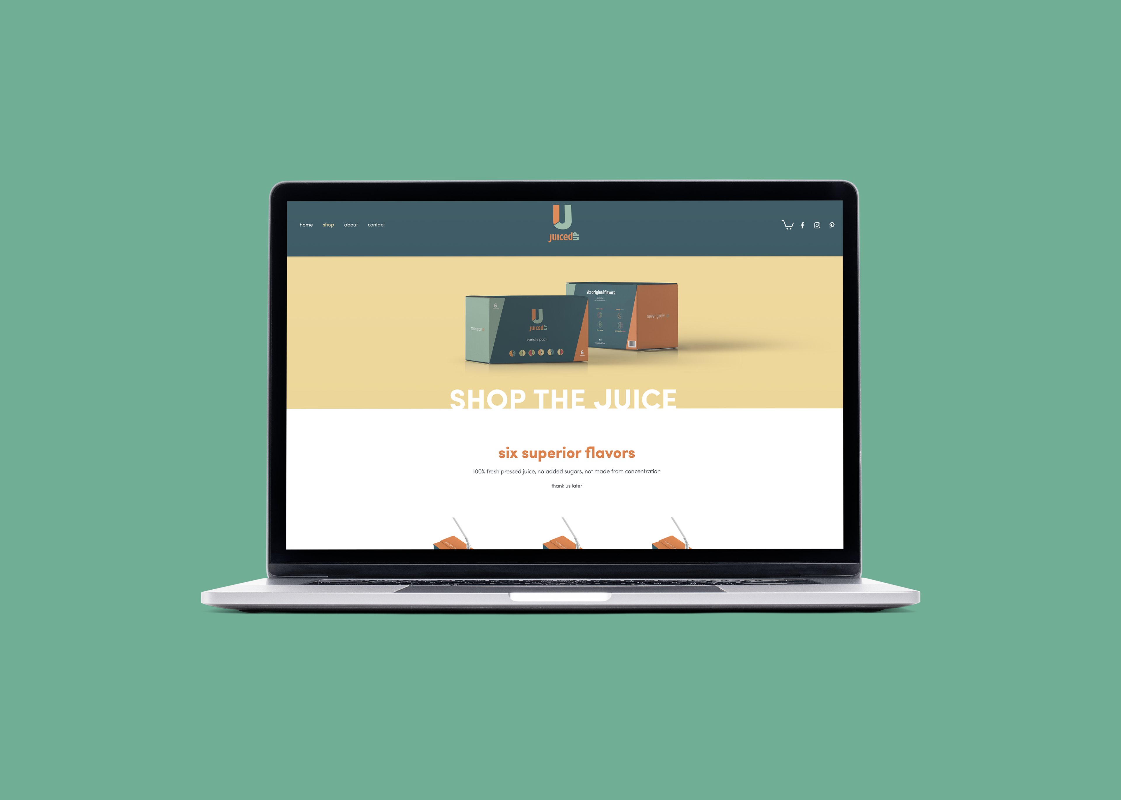
Website Design
The juicedUP website is an energetic and visually pleasing experience for users. Navigating the site is intuitive and displays a wide variety of product imagery and information. Acting as a mock e-commerce sight, the brand identity is easy to understand and digest while browsing the pages. Implementing found imagery and page animations provides the energy and authenticity this brand needed to maximize its existence, go see for yourself!

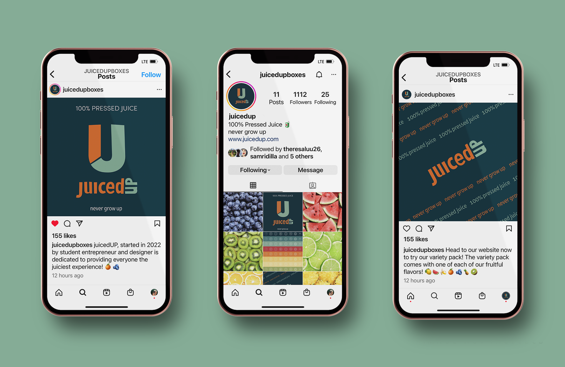
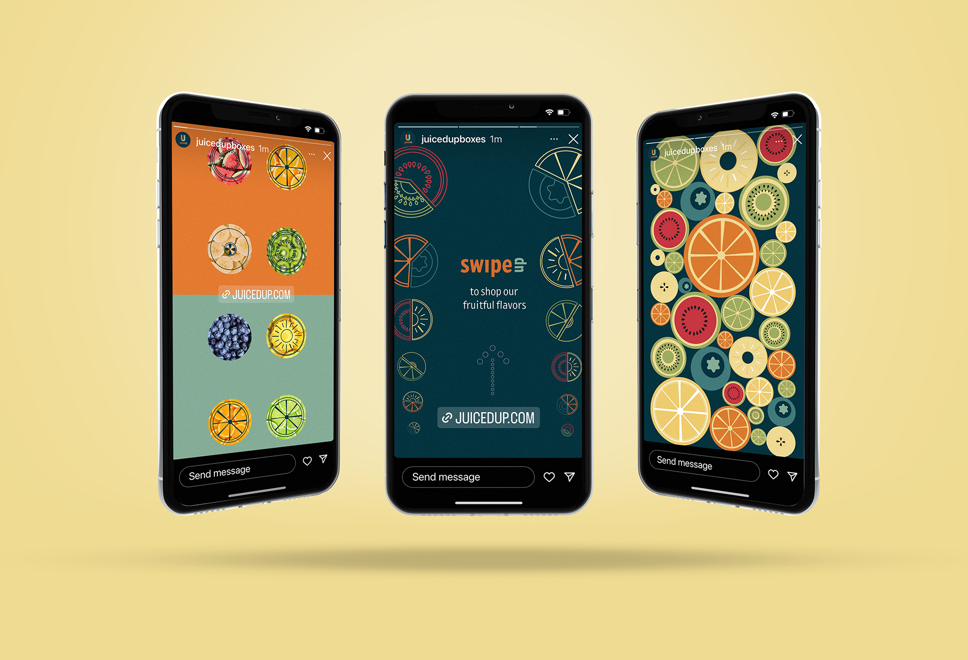
Reaching Our Audience
Simple promotional routes were explored through feed development and story posts. Developing an aesthetic for the brand's social media presence and creating posts that provoke action by viewers was a simple task to develop the identity.

Institution: Tyler School of Art and Architecture
Art Direction: Soonduk Krebs
2022