
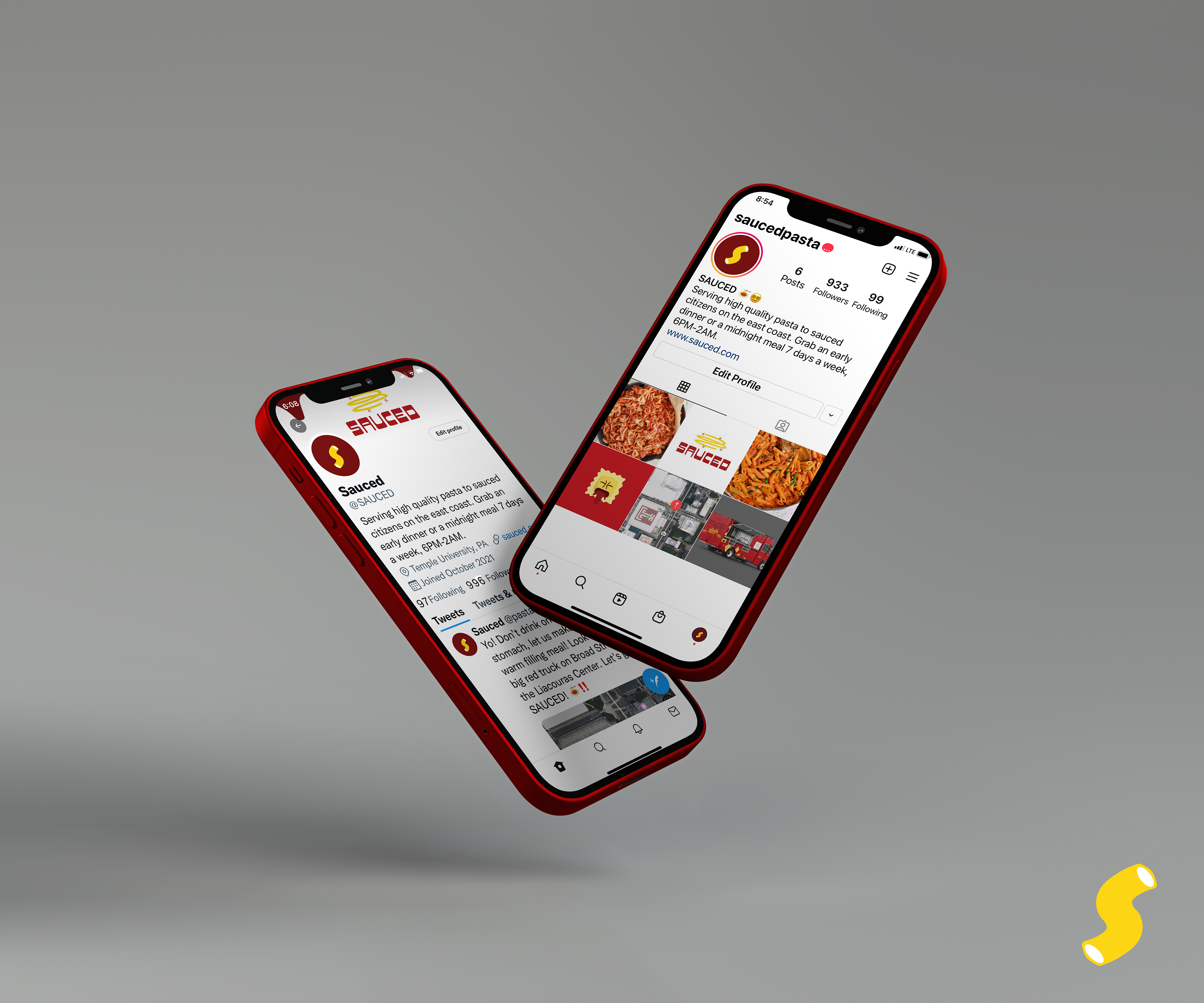
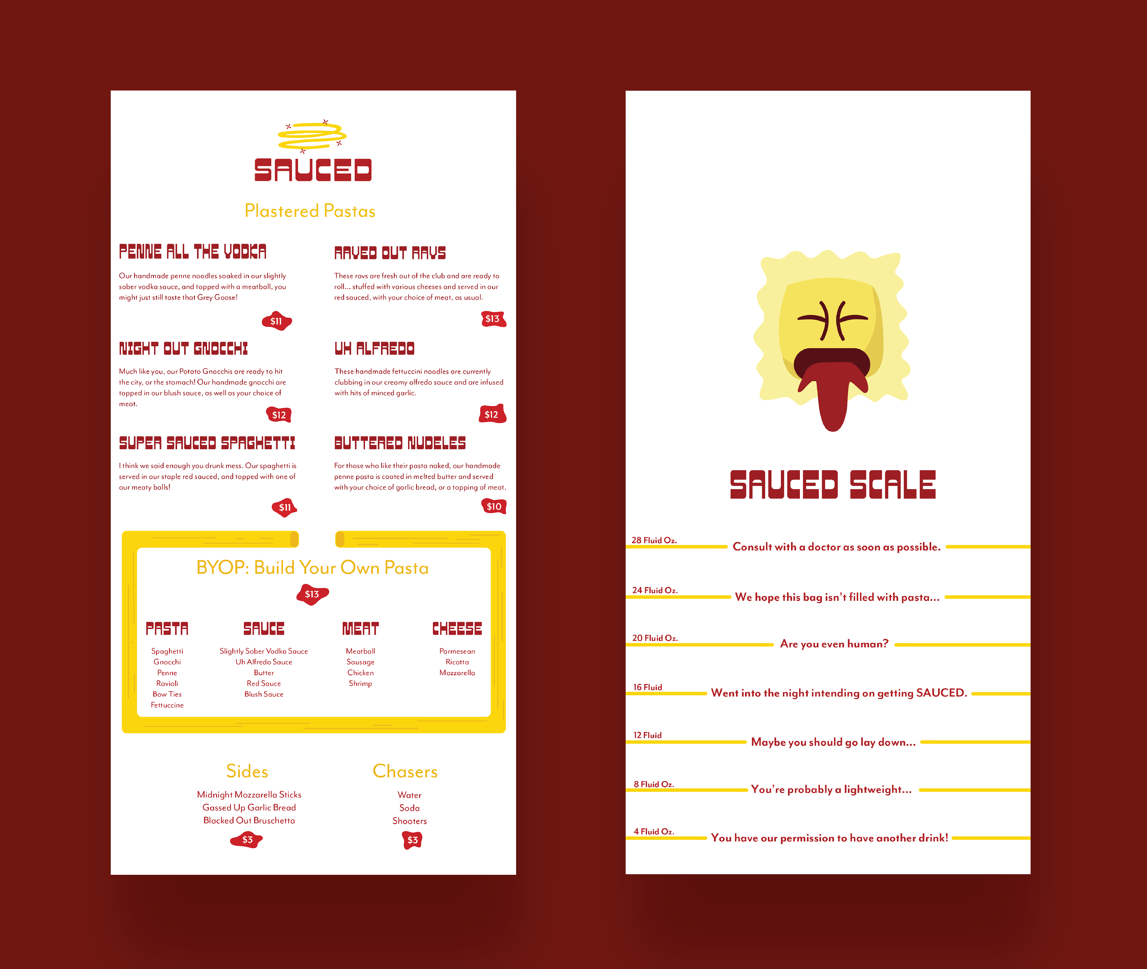
SAUCED
SAUCED is for party and pasta lovers around the world. Operating from 6 PM-2 AM, this late-night food truck targets those who indulge in good food and good times. Inspired by the wide variety of food trucks on Temple Universitie's campus, I desired to create a solution for the sauced students! Focused on serving high-quality and locally sourced ingredients with a tipsy twist. Whether you and your friends are sauced or sober, our perfectly proportioned pasta dishes will not disappoint!
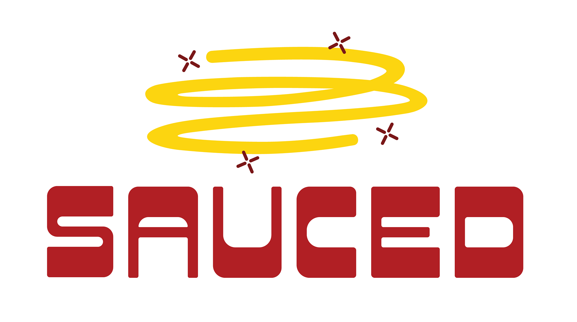

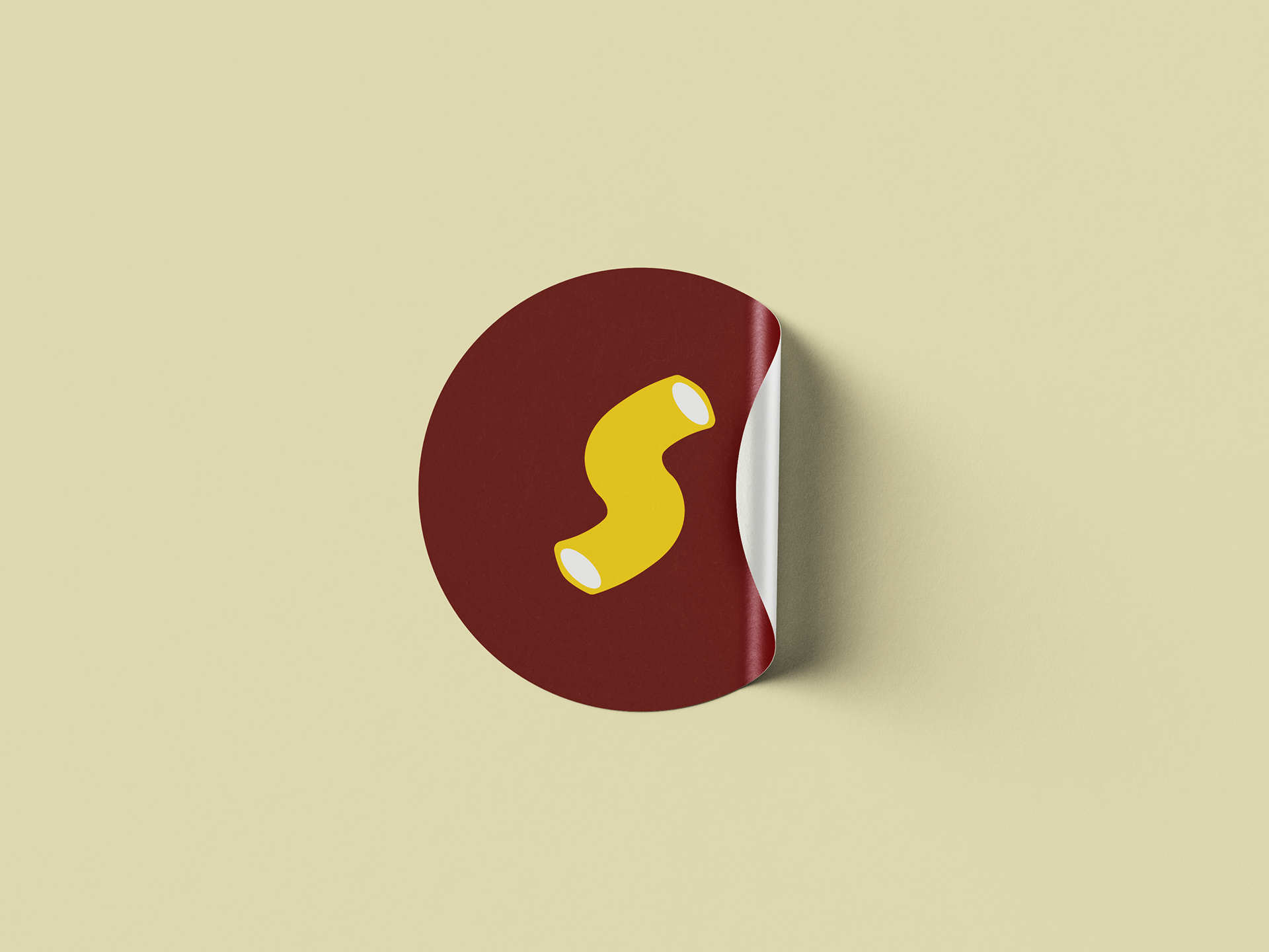
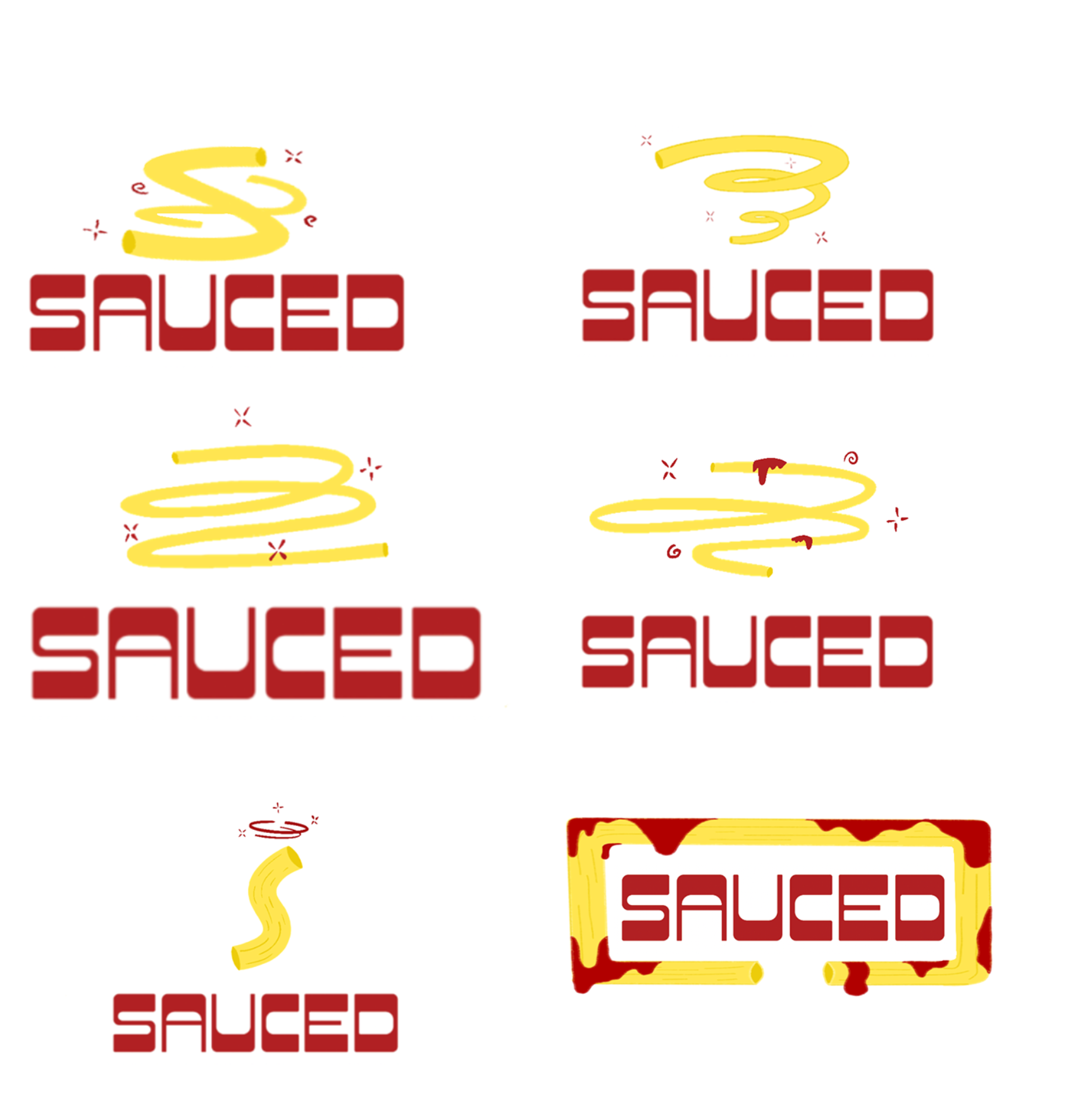
Primary and Secondary Logo
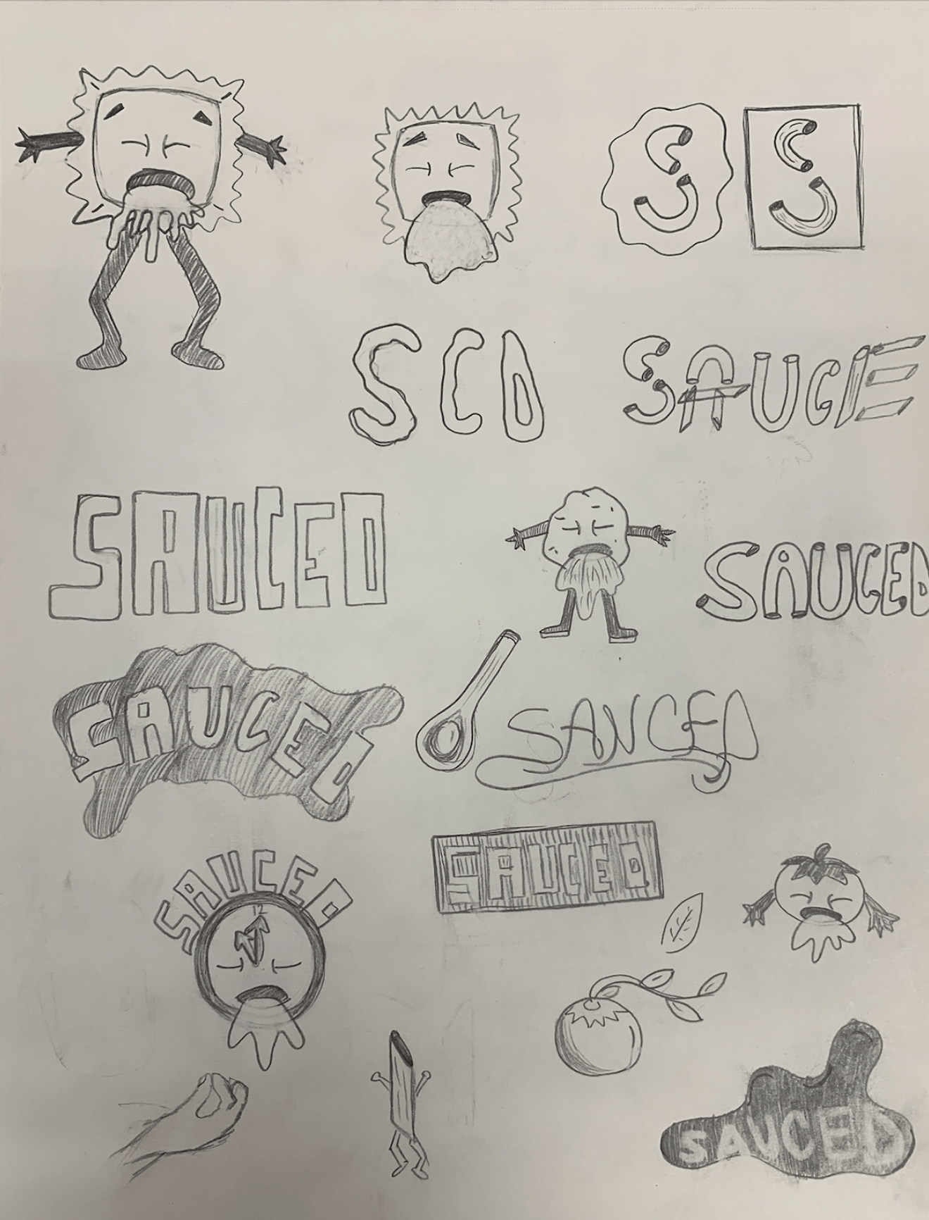
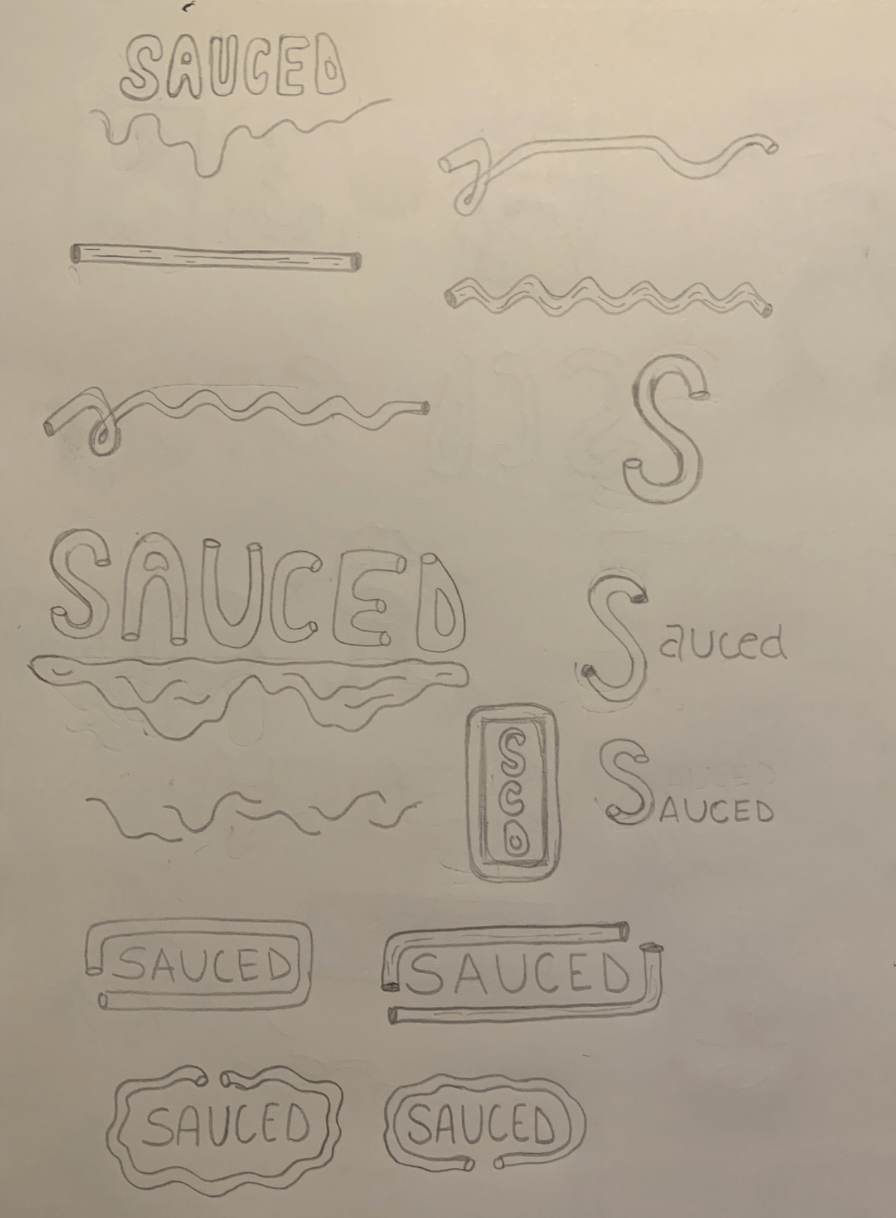
The primary logo for SAUCED, is intended to resemble an extent of dizziness and lack of sobriety. The font chosen for the primary logo is short but thick with rounded edges. These design choices present viewers with the opportunity to read the name of the brand in a definitive tone.
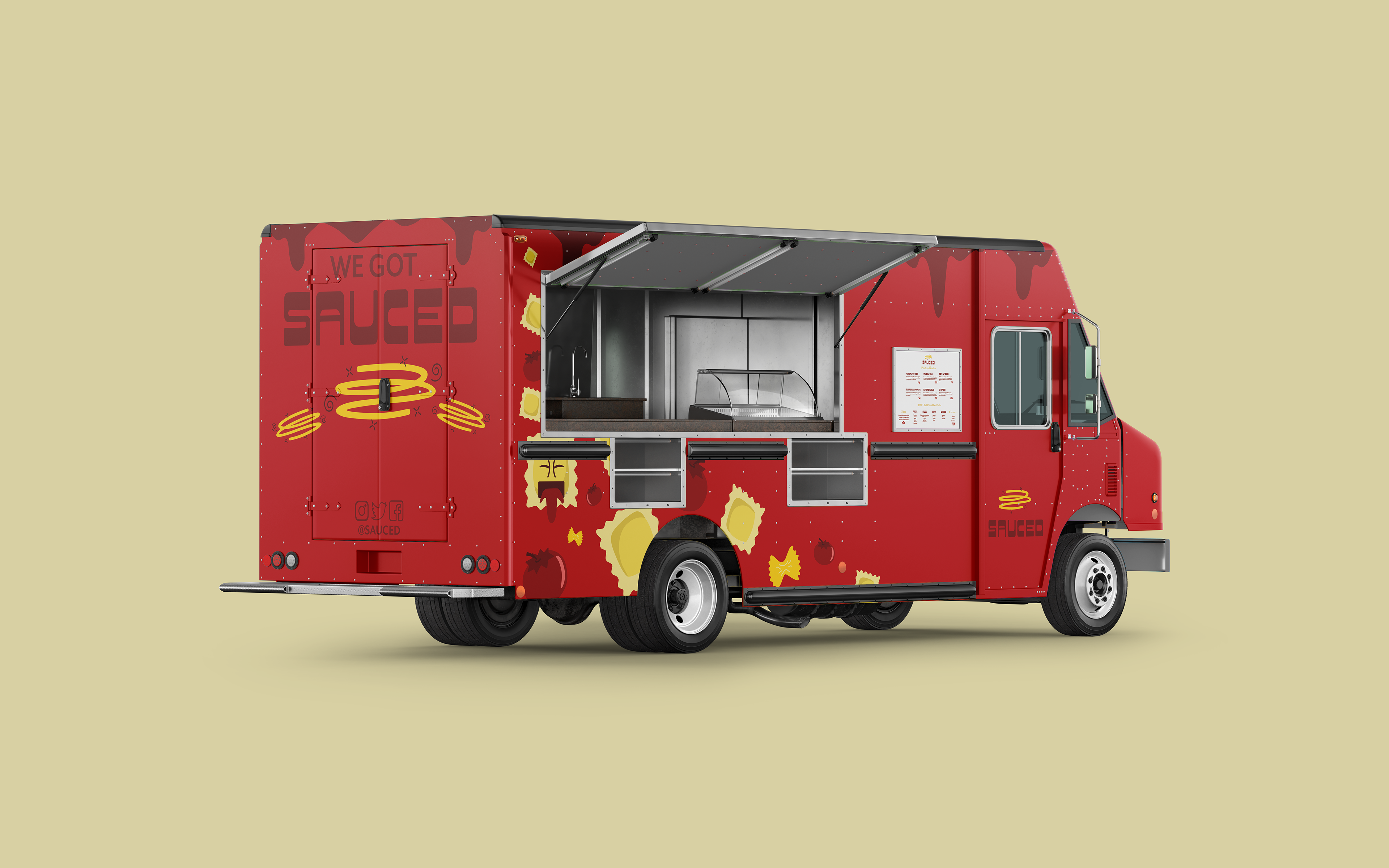
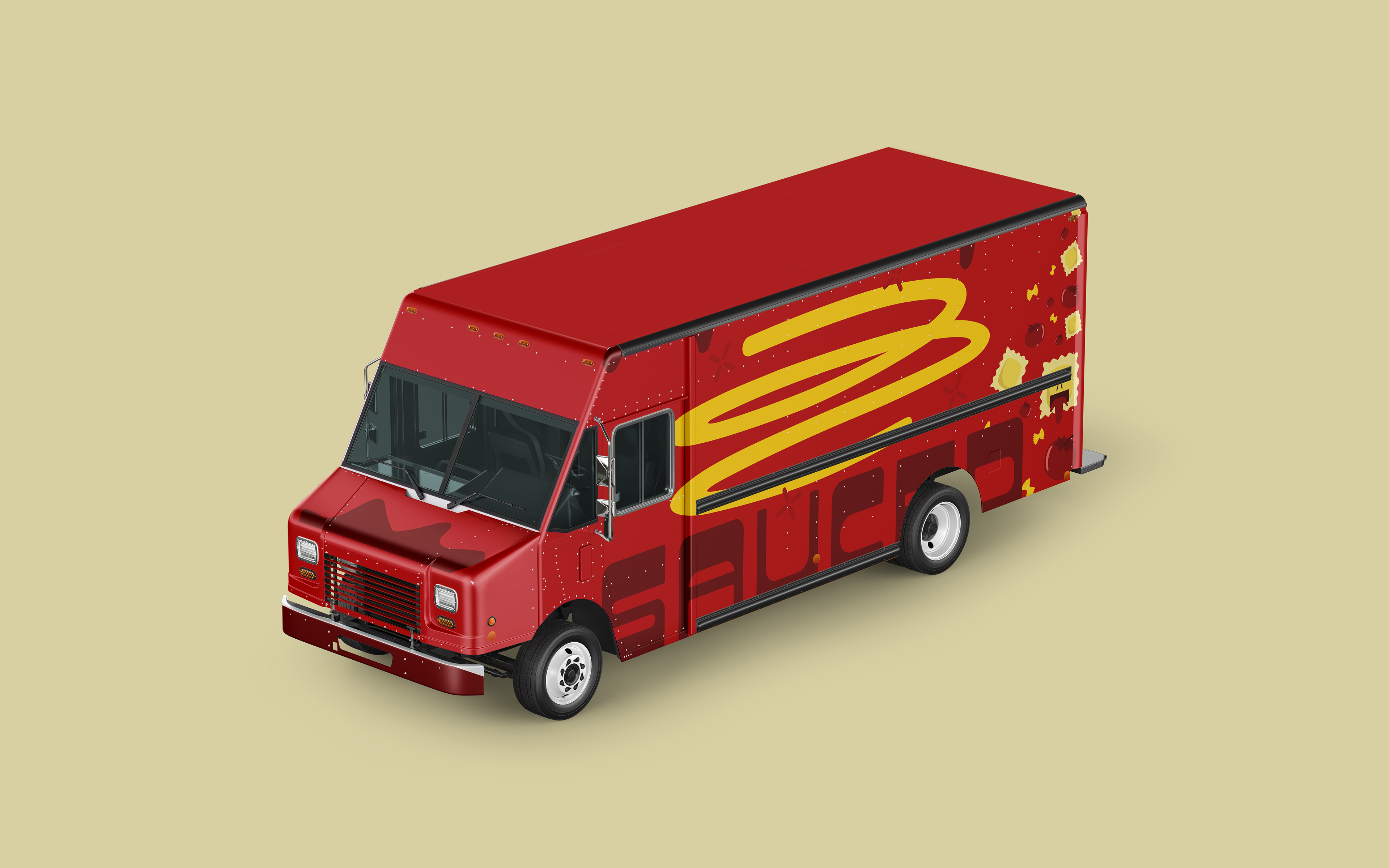
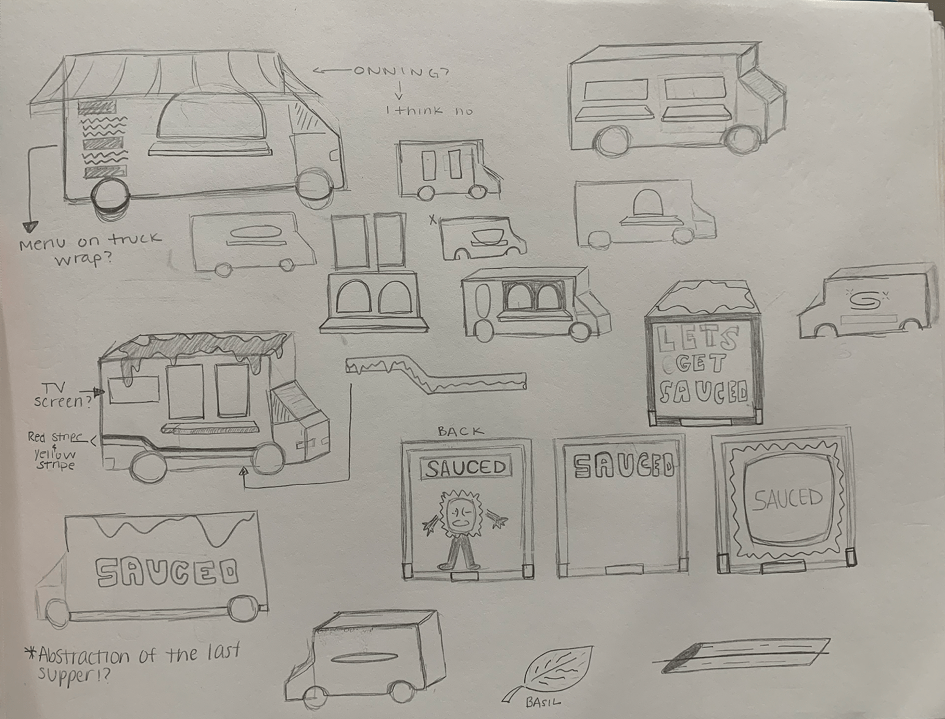
Truck Exterior
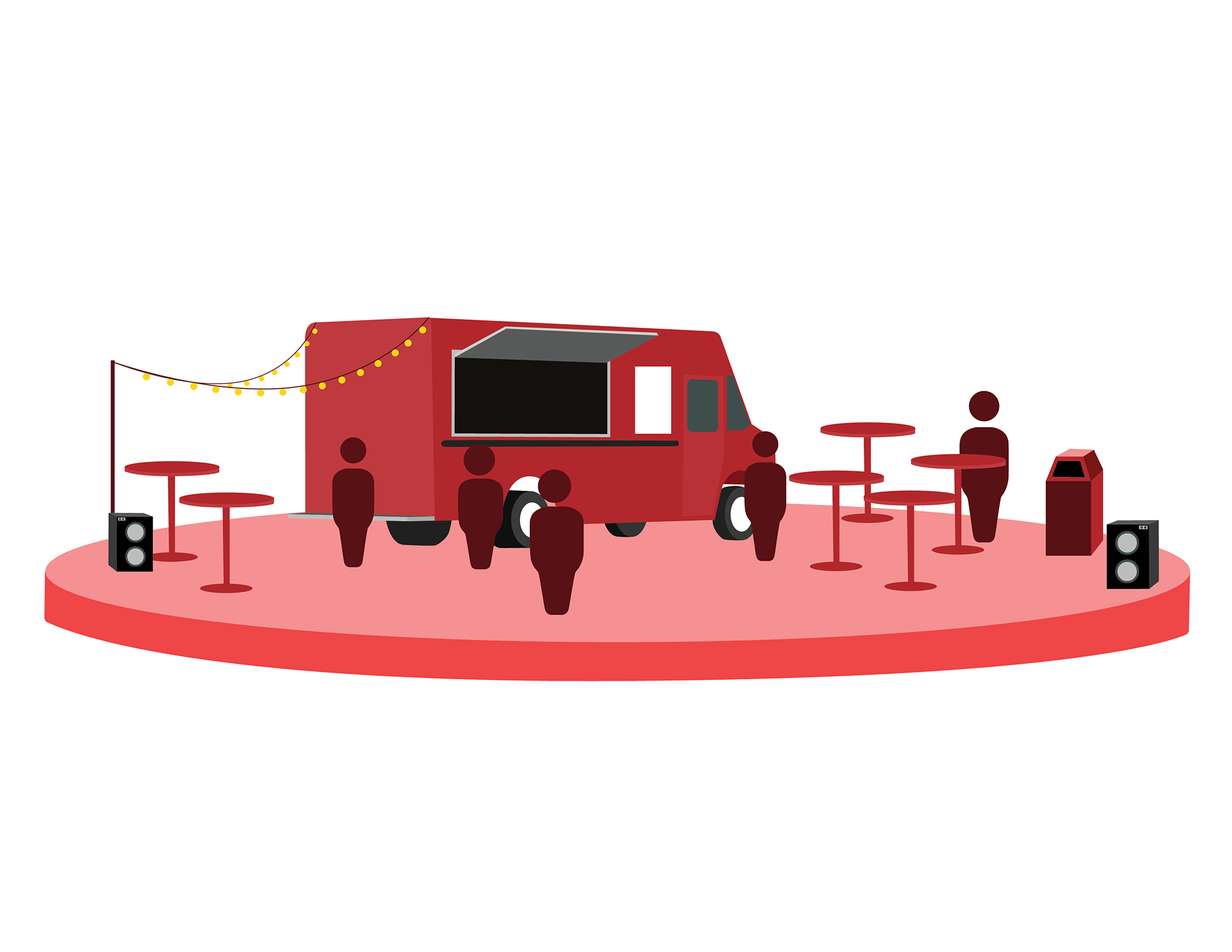
Naturally, the truck is intended to look as saucy as possible, making it impossible to miss when passing by! Utilizing the red tones of my color palette to its maximum potential allows for a design that feels refined yet energetic. Considering the visual balance of yellow tones on the design to lead the viewers eyes around the truck and create customer involvement.
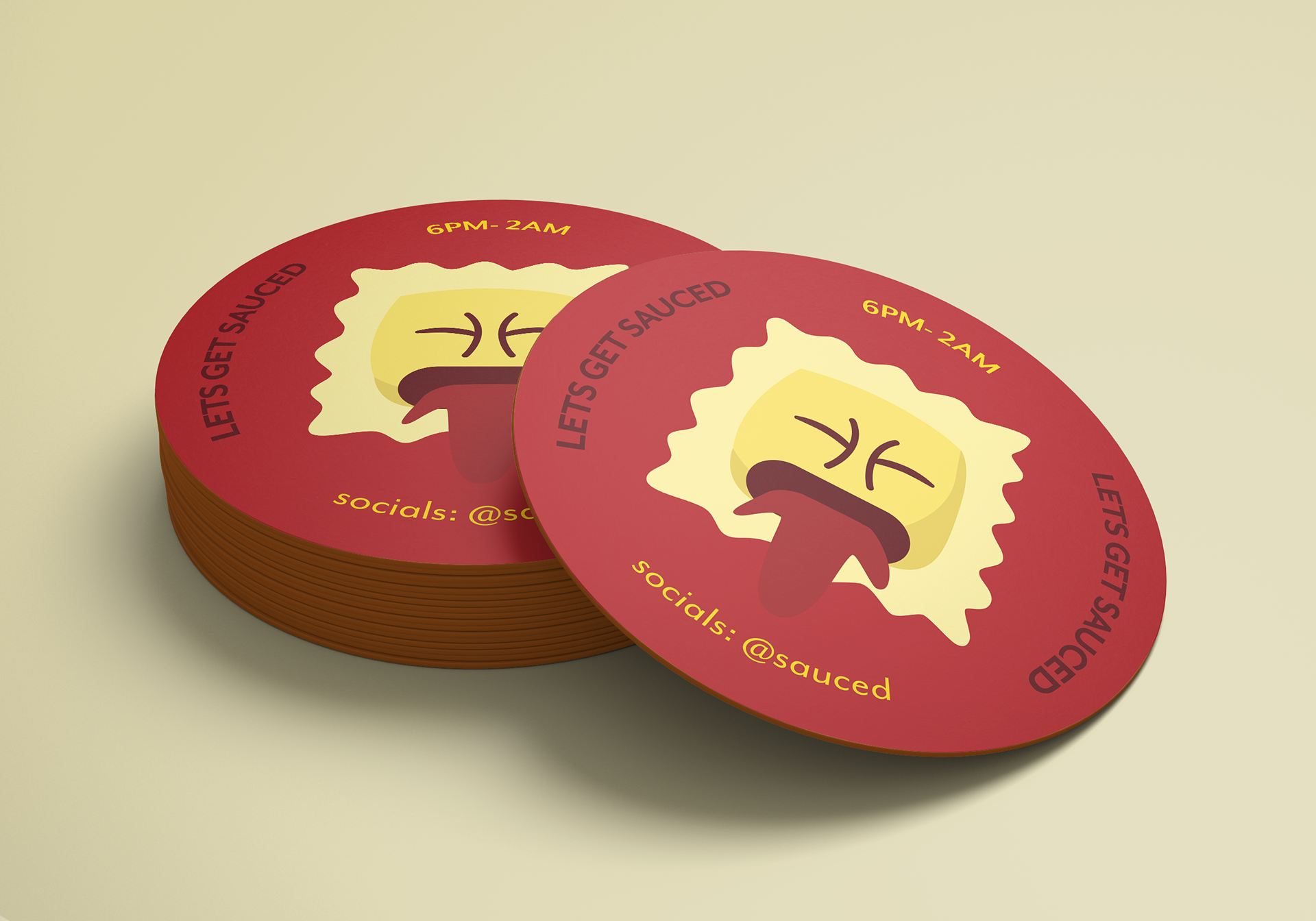
Brand Collateral
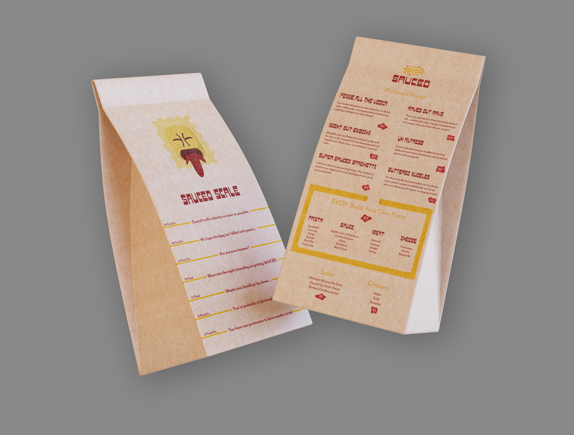
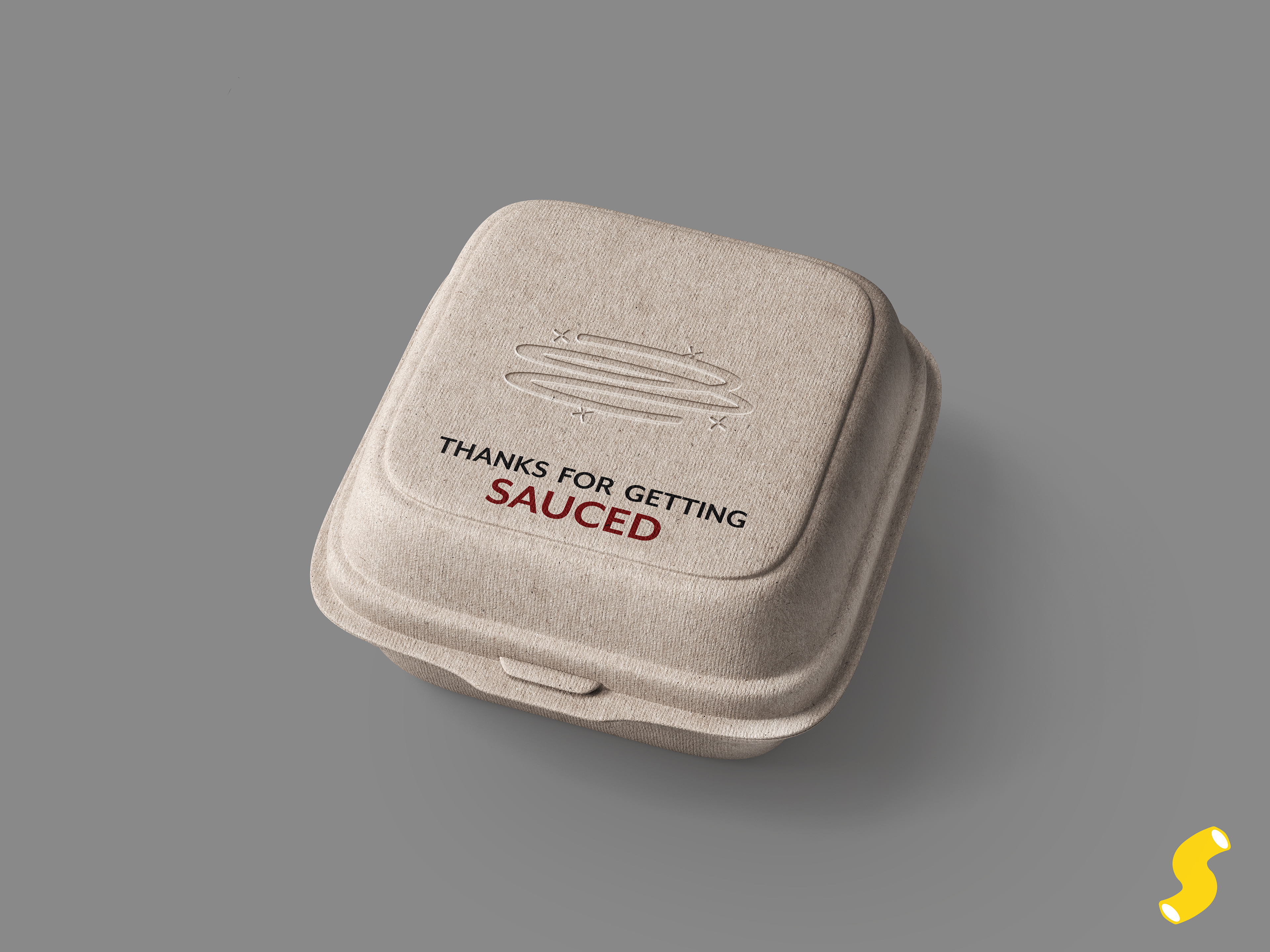
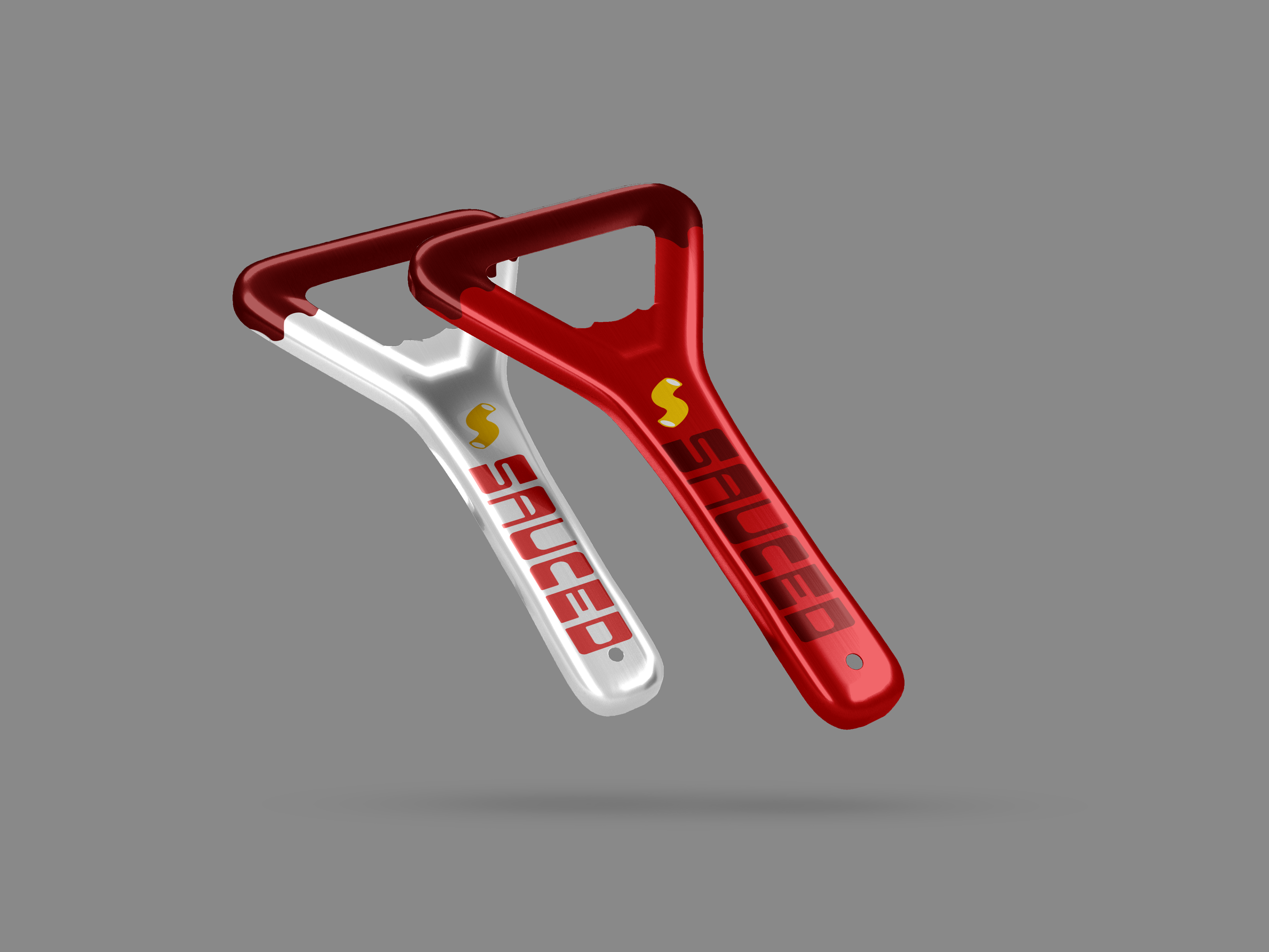
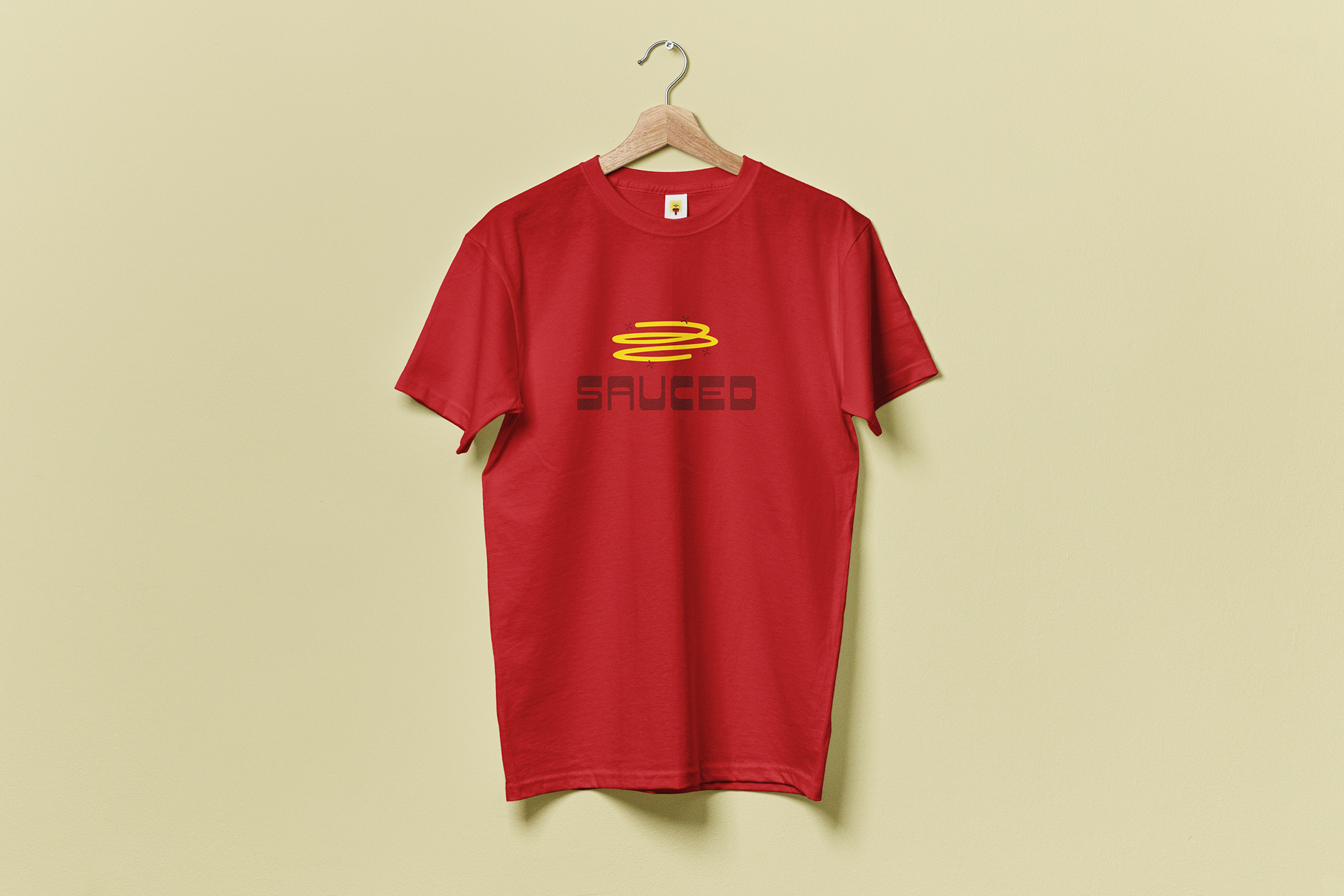
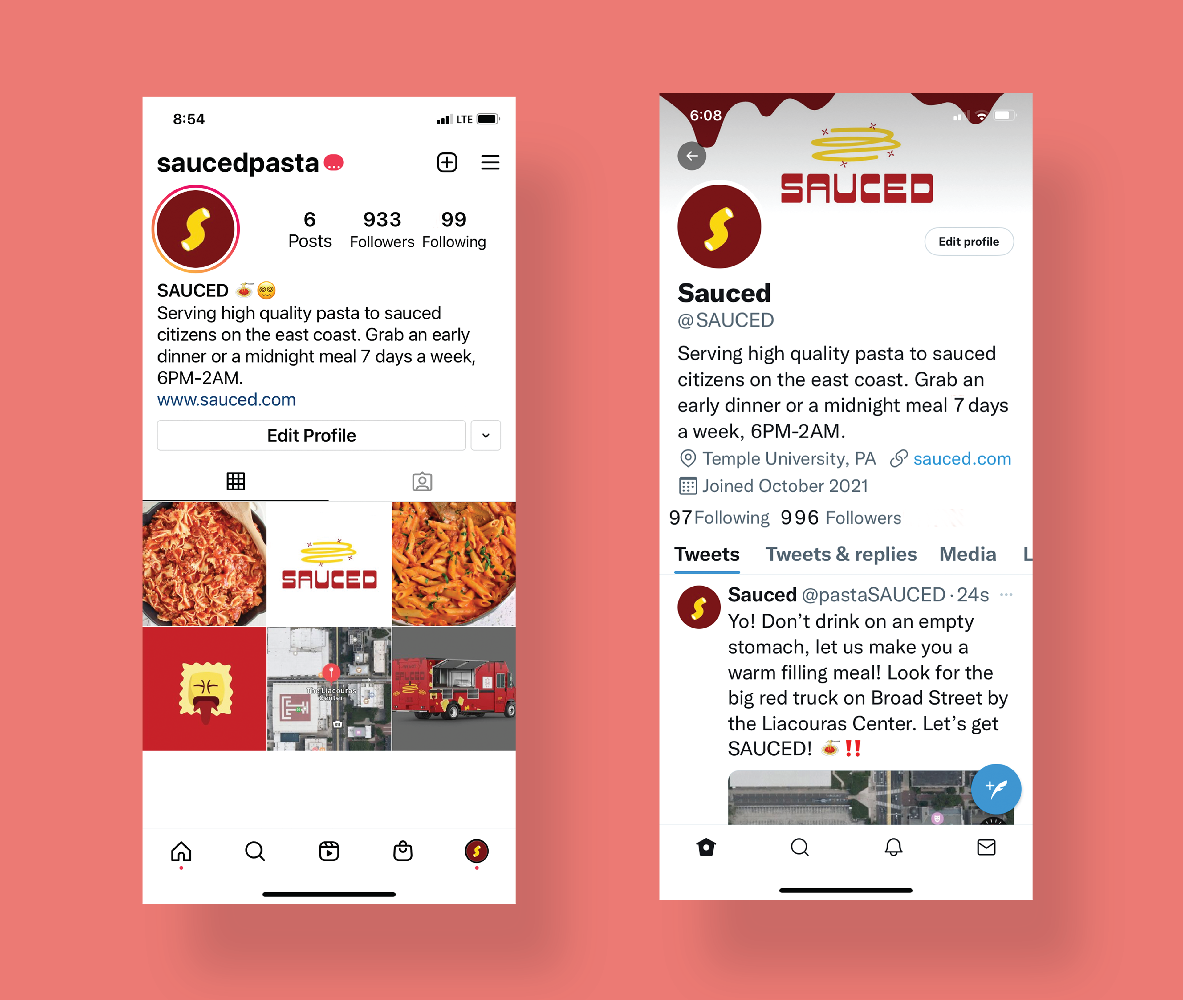
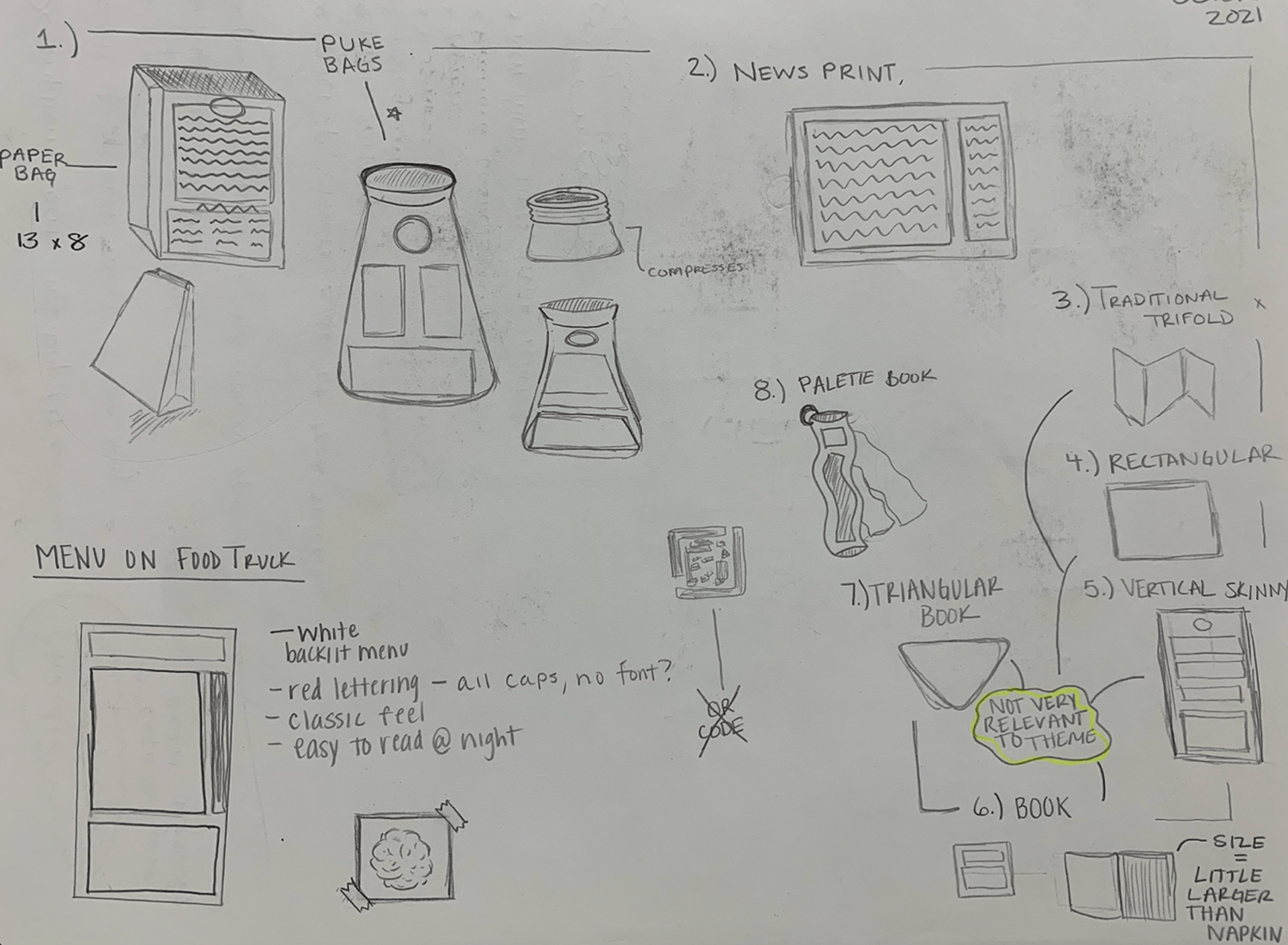
Free stuff is a key element in the development and marketing of any successful business. I decided to use items that are more humorous and play into the persona of the brand. Using the takeout bag as a menu allows the bag to act as a memorable promotional item when paired with a design-forward element on the other side. These simple acts elevate the appeal of a paper bag and make it far more memorable for customers. Other promotional items designed and more fitting to the "SAUCED" brand were bottle openers, shot glasses, drink coasters, and t-shirts.
Process
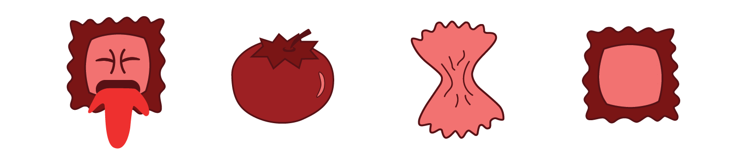
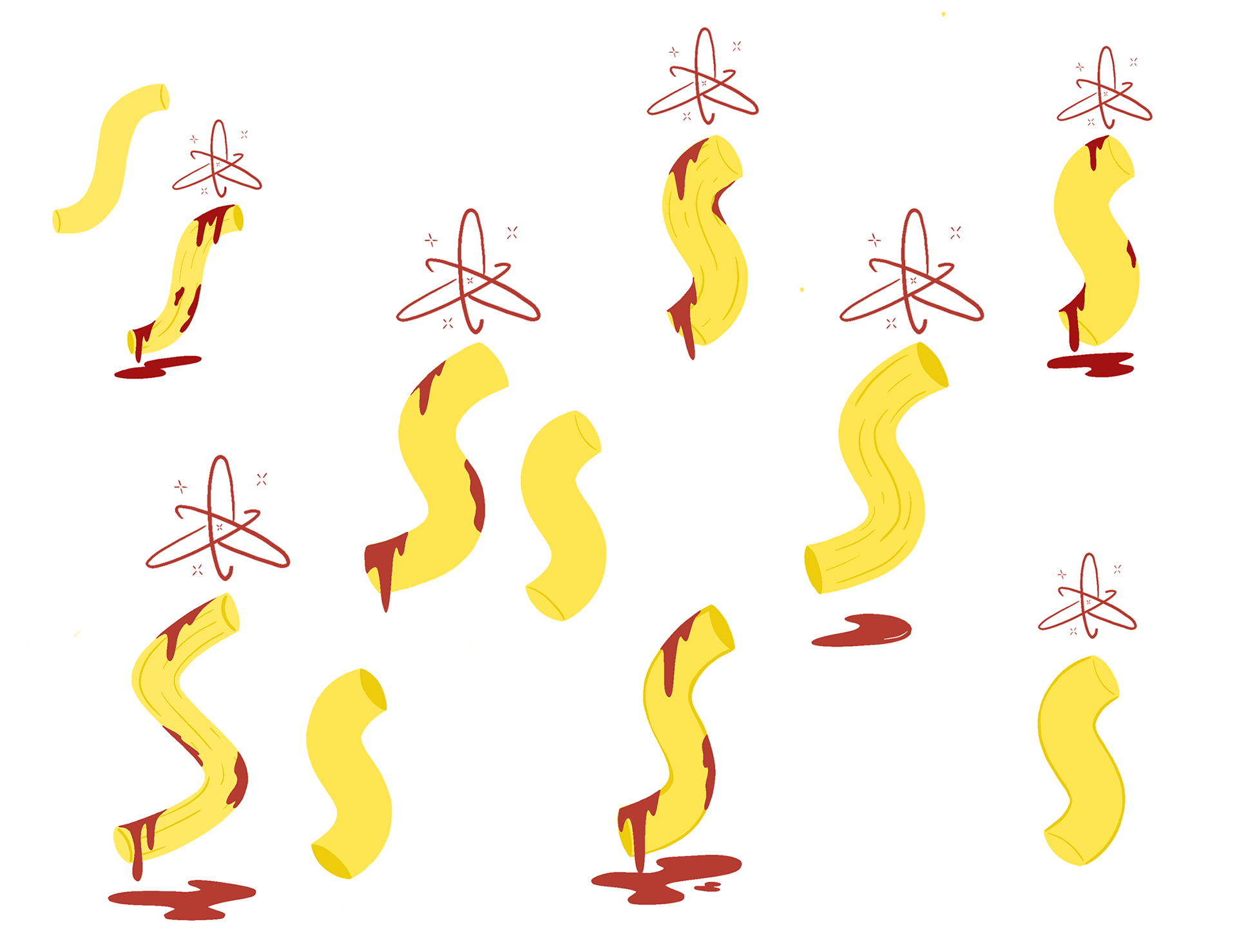
While curating the brand SAUCED, the vision was consistent and strong, allowing for a recognizable brand identity. The implementation of a monochromatic color palette assists the brand overall as well as the elements that makeup SAUCED. Using shades of yellow while trying to keep an overwhelming amount of red was slightly hard, especially on the truck, but a balance was achieved. Creating a brand that is loosely based around catering to those who indulge in nightlife allowed for amusing brand collateral and concepts such as nausea bags and vomiting ravioli!


Institution: Tyler School of Art and Architecture
Art Direction: Bryan Satalino
2021